Differential Expression Analysis
spata-de-analysis.RmdDifferential expression analysis aims to discover quantitative changes in gene-expression levels between defined experimental groups. In SPATA these experimental groups are defined inside the feature data. More precisely: Every discrete variable that is part of the spata-object’s feature data assigns every sample’s barcode-spot to such an experimental group. This includes all spata-intern generated groups such as segmentation and clustering as well as any other discrete feature of your own extracted analysis that has been added via addFeature(). See Extract, add & join data on how to do that with ease.
Differential expression analysis
The following tutorial steps will guide you through the spata-intern differential gene expression functions using a previously created segmentation as the experimental groups.
# load packages
library(SPATA)
library(magrittr)
library(ggplot2)

# load object
spata_obj <- loadSpataObject(input_path = "data/spata-obj-de-analysis-example.RDS")

plotSegmentation(spata_obj)
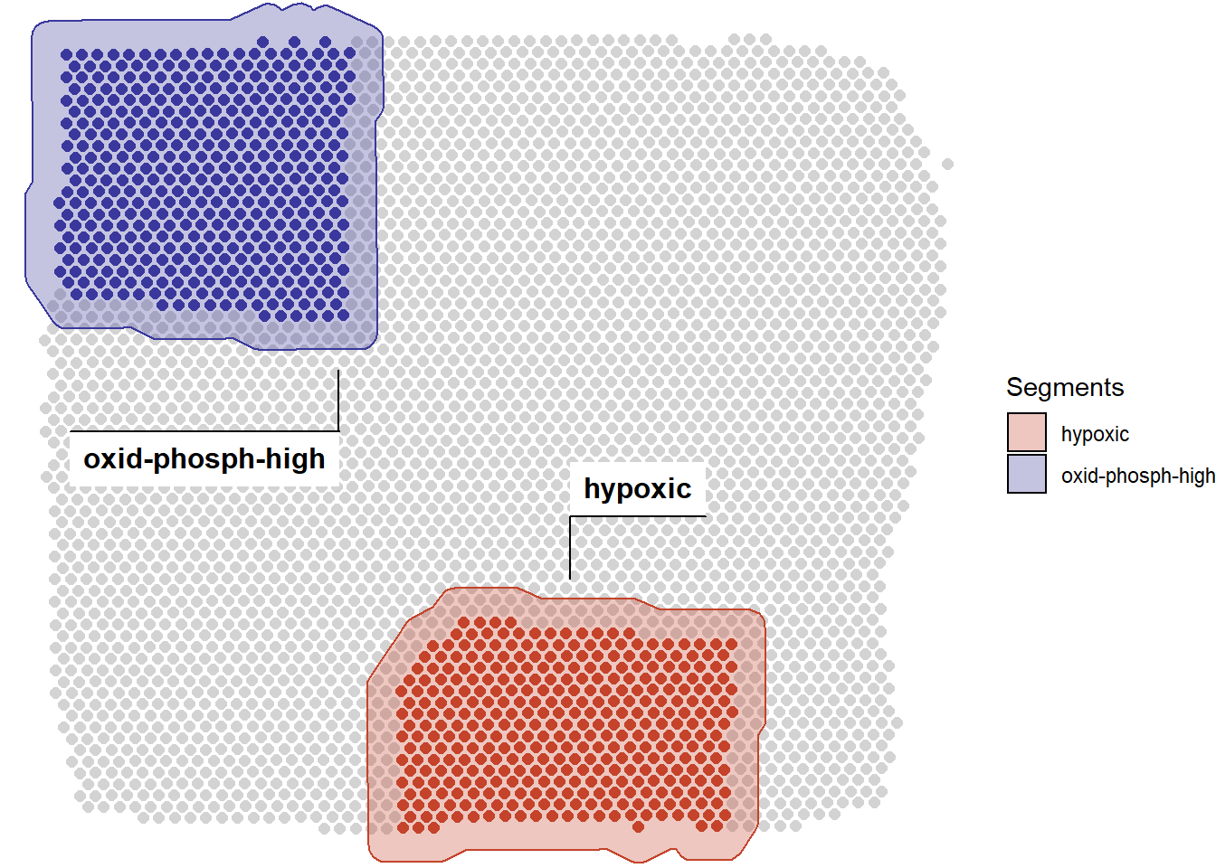
Figure 1. Spatial segmentation of two areas of interest.
1. Find differentially expressed genes
As mentioned in previous chapters SPATA makes use of some well written functions of the Seurat-package which currently define the gold-standard of statistical scRNA-seq analysis. The function findDE()is a wrapper around Seurat::FindAllMarkers() and lets you denote the experimental groups across which you want to analyze diferentially expressed genes. You can do that via the across-argument which we are going to denote as segment as this is the feature we are interested in for now. (If you are only interested in a subset of groups the specified variable contains use the across_subset-argument to filter for those).
de_results <-
  findDE(object = spata_obj,
         across = "segment", # denotes experimental group belonging of interest
         across_subset = c("oxid-phosph-high", "hypoxic"), # subsets the groups
         method_de = "wilcox",
         p_val_adj = 0.05)

# output
de_results
2. Filter according to your needs
In order to post-process the resulting de-data.frame use filterDE(). The data.frame will be sliced in order that for every cluster n-genes are filtered depending on the input of n_highest_FC and n_lowest_pvalue.
filtered_de_results <-
  filterDE(de_df = de_results,
           n_highest_FC = 100, # keep the 100 genes with the highest log fold change
           n_lowest_pvalue = 50, # from these 100 genes keep the 50 genes with the lowest p-value
           return = "data.frame")

filtered_de_results
3. Plot your results
The gold standard of differentially gene expression visualization is the classical heatmap. plotDeHeatmap() takes your DE-results and plots the respective heatmap by extracting the genes and barcode-spots of interest. Via additional computation the heatmap is segmented into clear and aesthetically pleasing rectangulars. Additional arguments to pheatmap::pheatmap() can be specified via ....
heatmap <-
  plotDeHeatmap(object = spata_obj,
                de_df = filtered_de_results, # specify the data
                across = "segment",  # specify the feature
                across_subset = unique(filtered_de_results$cluster),
                hm_colors = viridis::inferno(n = 15), # provide your color spectrum of choice
                breaks = c( c(-5.5, -0.6), seq(-0.5,1.8, length.out = 10), c(1.9, 3)),
                show_rownames = FALSE)

heatmap
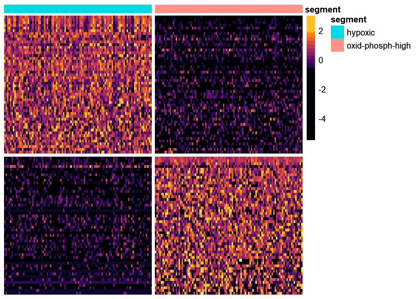
Figure 2. Heatmap visualizing the differentially expressed genes
In order to visualize only a subset of genes make use of plotDistributionAcross() which plots the distribution of specific variables across specific subgroups.
genes_of_interest <-
    filterDE(de_df = de_results,
             n_highest_FC = 10,
             n_lowest_pvalue = 10,
             return = "vector") # obtain only a vector of genes as input for 'variables'

plotDistributionAcross(spata_obj,
                       variables = genes_of_interest,
                       across = "segment",
                       across_subset = c("oxid-phosph-high", "hypoxic"),
                       plot_type = "violin") +
  theme(axis.text.x = element_blank(),
        legend.position = "top")
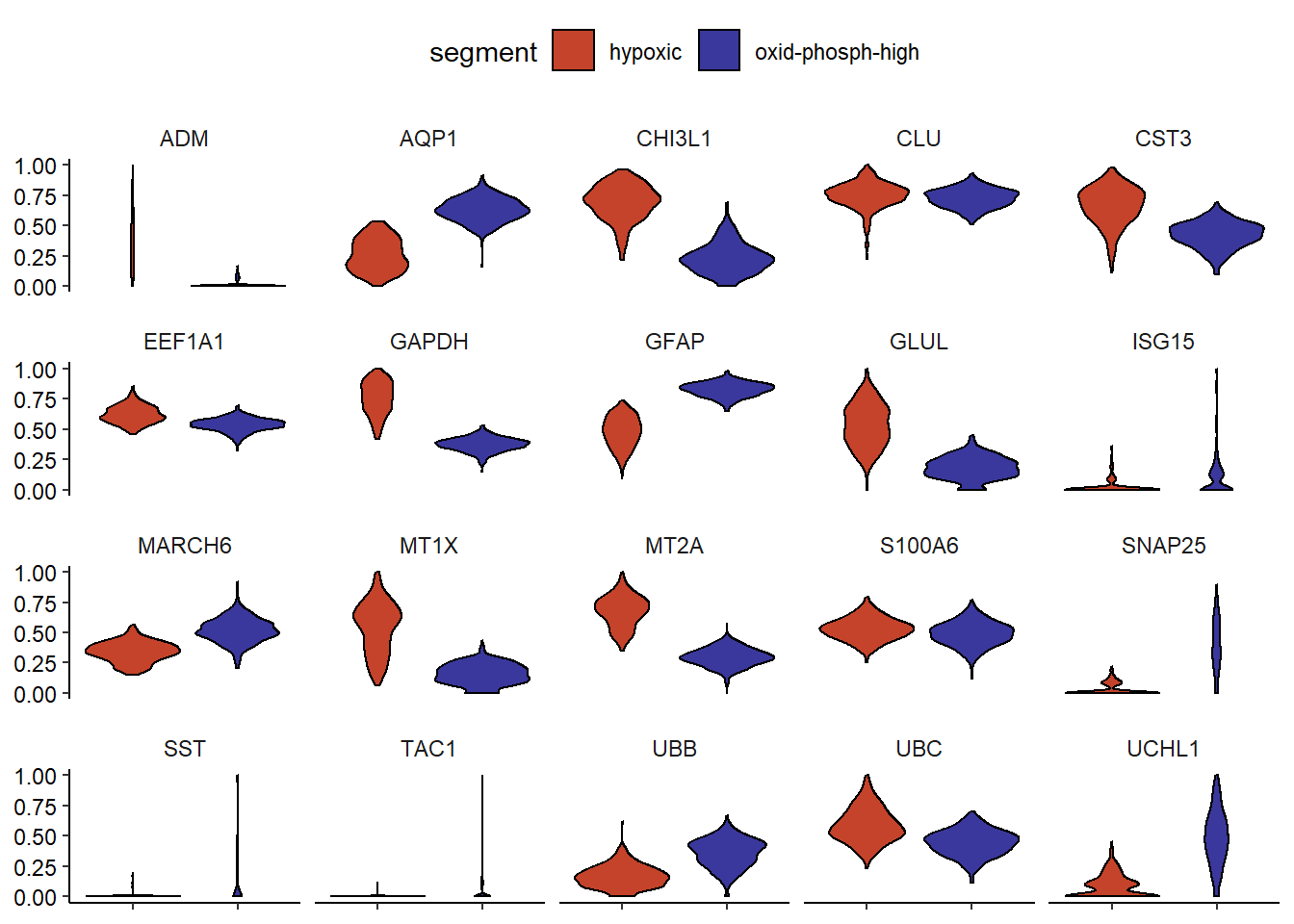
Figure 2.2) Violinplot visualizing the differentially expressed genes
Another way to visualize your results would be to deploy plotSurfaceComparison().
hypoxic_high_genes <- genes_of_interest <-
    filterDE(de_df = de_results,
             n_highest_FC = 10,
             n_lowest_pvalue = 10,
             across_subset = "hypoxic",
             return = "vector")

plotSurfaceComparison(spata_obj,
                      variables = hypoxic_high_genes,
                      smooth = TRUE,
                      pt_size = 1)
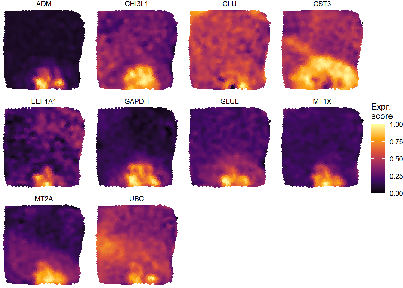
Figure 2.3) Surfaceplots visualizing the differentially expressed genes