SPATA & The tidyverse
spata-in-the-tidyverse.RmdThe tidyverse is a collection of R-packages that provide consistent tools to work with data.frames in a tidy-data fashion. SPATA attempts to provide it’s results in a way that you can leverage the power of these tools. The following two examples are supposed to give insight in our approaches and to highlight the use of SPATA’s joinWith-family in combination with the tidyverse.
Example 1: Four states
Neftel et al. 2019 (Figure 3) suggested an integrative model which assigned glioblastoma-cells into four different states according to the results of the conducted gene expression analysis. The distribution of these states was displayed in a scatterplot in which each dot represented a cell and the dot’s position represented it’s differentiation level towards these defined states. The concept of this visualization technique is manifested in the SPATA-function plotFourStates() and can be emulated with just a handful of tidyverse-functions.
#load packages
library(SPATA)
library(tidyverse)
library(magrittr)

# load glioblastoma sample
spata_obj <- loadSpataObject("data/spata-obj-four-states-example.RDS")

# the respective states were stored in the gene-set data.frame via addGeneSets()
neftel_states <- c("Neftel_OPClike","Neftel_NPClike2", "Neftel_AClike", "Neftel_Mes_Comb")

# output
neftel_states
## [1] "Neftel_OPClike" "Neftel_NPClike2" "Neftel_AClike" "Neftel_Mes_Comb"# display the respective genes getGenes(object = spata_obj, of_gene_sets = neftel_states, simplify = FALSE)
## $Neftel_OPClike
##  [1] "BCAN"    "PLP1"    "GPR17"   "FIBIN"   "LHFPL3"  "OLIG1"   "PSAT1"
##  [8] "SCRG1"   "OMG"     "APOD"    "SIRT2"   "TNR"     "THY1"    "PHYHIPL"
## [15] "NKAIN4"  "PTPRZ1"  "VCAN"    "DBI"     "PMP2"    "CNP"     "TNS3"
## [22] "LIMA1"   "CA10"    "PCDHGC3" "CNTN1"   "SCD5"    "P2RX7"   "CADM2"
## [29] "TTYH1"   "FGF12"   "TMEM206" "NEU4"    "FXYD6"   "RNF13"   "RTKN"
## [36] "GPM6B"   "LMF1"    "ALCAM"   "PGRMC1"  "HRASLS"  "BCAS1"   "RAB31"
## [43] "PLLP"    "FABP5"   "NLGN3"   "SERINC5" "EPB41L2" "GPR37L1"
##
## $Neftel_NPClike2
##  [1] "STMN2"        "CD24"         "RND3"         "TUBB3"        "MIAT"
##  [6] "DCX"          "NSG1"         "ELAVL4"       "MLLT11"       "DLX6-AS1"
## [11] "SOX11"        "NREP"         "FNBP1L"       "TAGLN3"       "STMN4"
## [16] "DLX5"         "SOX4"         "MAP1B"        "RBFOX2"       "STMN1"
## [21] "TMEM161B-AS1" "DPYSL3"       "SEPT3"        "PKIA"         "ATP1B1"
## [26] "DYNC1I1"      "CD200"        "SNAP25"       "PAK3"         "NDRG4"
## [31] "KIF5A"        "UCHL1"        "ENO2"         "KIF5C"        "DDAH2"
## [36] "TUBB2A"       "LBH"          "TCF4"         "GNG3"         "NFIB"
## [41] "DPYSL5"       "CRABP1"       "DBN1"         "NFIX"         "CEP170"
## [46] "BLCAP"
##
## $Neftel_AClike
##  [1] "CST3"    "S100B"   "SLC1A3"  "HEPN1"   "HOPX"    "MT3"     "SPARCL1"
##  [8] "MLC1"    "GFAP"    "FABP7"   "BCAN"    "PON2"    "METTL7B" "SPARC"
## [15] "GATM"    "RAMP1"   "PMP2"    "AQP4"    "DBI"     "EDNRB"   "PTPRZ1"
## [22] "CLU"     "PMP22"   "ATP1A2"  "S100A16" "HEY1"    "PCDHGC3" "TTYH1"
## [29] "NDRG2"   "PRCP"    "ATP1B2"  "AGT"     "PLTP"    "GPM6B"   "F3"
## [36] "RAB31"   "ANXA5"   "TSPAN7"
##
## $Neftel_Mes_Comb
##  [1] "HILPDA"   "ADM"      "DDIT3"    "NDRG1"    "HERPUD1"  "DNAJB9"
##  [7] "TRIB3"    "ENO2"     "AKAP12"   "SQSTM1"   "MT1X"     "NAMPT"
## [13] "NRN1"     "SLC2A1"   "BNIP3"    "LGALS3"   "INSIG2"   "IGFBP3"
## [19] "PPP1R15A" "VIM"      "PLOD2"    "GBE1"     "SLC2A3"   "FTL"
## [25] "WARS"     "XPOT"     "HSPA5"    "GDF15"    "ANXA2"    "EPAS1"
## [31] "LDHA"     "P4HA1"    "SERTAD1"  "PFKP"     "PGK1"     "EGLN3"
## [37] "SLC6A6"   "CA9"      "BNIP3L"   "TRAM1"    "UFM1"     "ASNS"
## [43] "GOLT1B"   "ANGPTL4"  "SLC39A14" "CDKN1A"   "HSPA9"    "CHI3L1"
## [49] "ANXA2"    "ANXA1"    "CD44"     "VIM"      "MT2A"     "C1S"
## [55] "NAMPT"    "EFEMP1"   "C1R"      "SOD2"     "IFITM3"   "TIMP1"
## [61] "SPP1"     "A2M"      "S100A11"  "MT1X"     "S100A10"  "FN1"
## [67] "LGALS1"   "S100A16"  "CLIC1"    "MGST1"    "RCAN1"    "TAGLN2"
## [73] "NPC2"     "SERPING1" "EMP1"     "APOE"     "CTSB"     "C3"
## [79] "LGALS3"   "MT1E"     "EMP3"     "SERPINA3" "ACTN1"    "PRDX6"
## [85] "IGFBP7"   "SERPINE1" "PLP2"     "MGP"      "CLIC4"    "GFPT2"
## [91] "GSN"      "NNMT"     "TUBA1C"   "GJA1"     "TNFRSF1A" "WWTR1"
# display the states on the surface plotSurfaceComparison(object = spata_obj, variables = neftel_states, smooth = TRUE, display_image = TRUE, pt_alpha = 0.5, pt_size = 1.5)
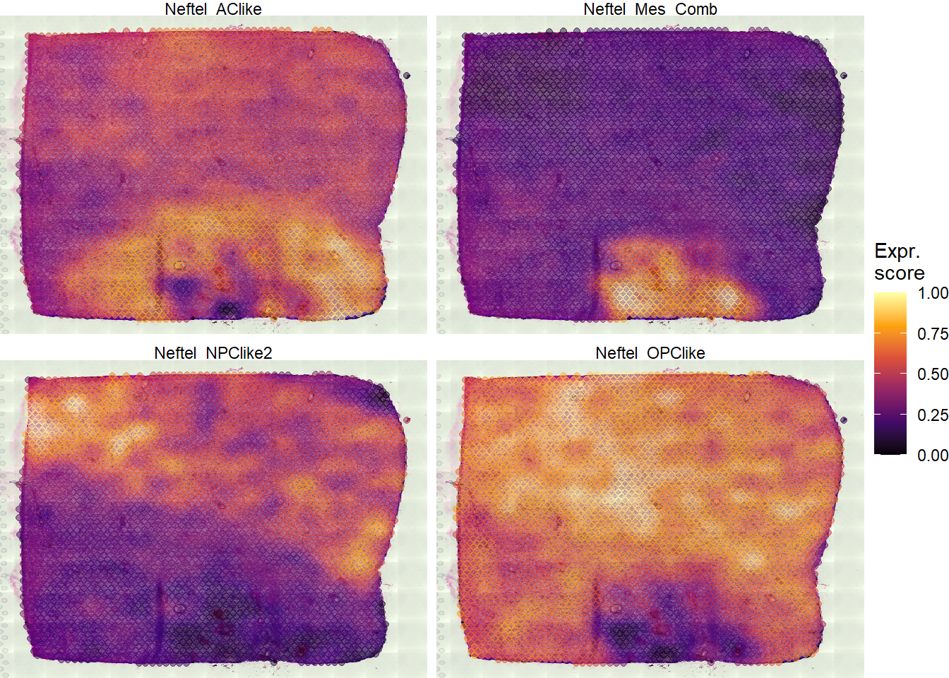
Figure 1.1 Surface plots color according to each of the four cellular states of Neftel et al. 2019.
1. Assemble the appropriate data.frame
neftel_df <-
  joinWithGeneSets(object = spata_obj,
                   spata_df = getSpataDf(spata_obj),
                   gene_sets = neftel_states)

# output
neftel_df
2. Compute the respective position of every barcode spot
# 1. shift the data.frame
shifted_df <-
    tidyr::pivot_longer(
      data = neftel_df,
      cols = all_of(neftel_states),
      names_to = "gene_set",
      values_to = "gene_set_expr"
    )

# output
shifted_df
# 2. figure out which of the four states is a barcode's maximum
#    by filtering for it
max_localisation <-
  group_by(shifted_df, barcodes) %>%
  filter(gene_set_expr == max(gene_set_expr)) %>%
  ungroup() %>%
  # rename the remaining gene sets to 'max_gene_set'
  select(barcodes, max_gene_set = gene_set, max_expr = gene_set_expr) %>%
  # assign the vertical localization of the state plot depending on where the maximum occured with a dichotome string
  mutate(max_loc = if_else(max_gene_set %in% neftel_states[1:2], true = "top", false = "bottom"))

# output
max_localisation
# 3. calculate the x-position
with_x_positions <-
  # rejoin the data
  left_join(x = neftel_df, y = max_localisation, by = "barcodes") %>%
  # calculate the position on the x-axis by comparing the respective gene-set expressions
    mutate(
      pos_x = case_when(
        max_loc == "top" & Neftel_OPClike > Neftel_NPClike2 ~ (log2(abs((Neftel_OPClike - Neftel_NPClike2) + 1)) * -1),
        max_loc == "top" & Neftel_NPClike2 > Neftel_OPClike ~ log2(abs((Neftel_NPClike2 - Neftel_OPClike) + 1)),
        max_loc == "bottom" & Neftel_AClike > Neftel_Mes_Comb ~ (log2(abs((Neftel_AClike - Neftel_Mes_Comb) + 1)) * -1),
        max_loc == "bottom" & Neftel_Mes_Comb > Neftel_AClike ~ log2(abs((Neftel_Mes_Comb - Neftel_AClike) + 1)))
    )

# output
with_x_positions
# 4. calculate the y-position
final_df <-
  group_by(.data = with_x_positions, barcodes) %>%
  mutate(
    pos_y = case_when(
      max_loc == "bottom" ~ (log2(abs(max(c(Neftel_AClike, Neftel_Mes_Comb)) - max(Neftel_OPClike, Neftel_NPClike2) + 1)) * -1),
      max_loc == "top" ~ log2(abs(max(c(Neftel_OPClike, Neftel_NPClike2)) - max(Neftel_AClike, Neftel_Mes_Comb) + 1))
    )
  ) %>%
  # filter out na values
  filter(!is.na(pos_x) & !is.na(pos_y))

# output
final_df
3. Plotting with ggplot2
Once the data-wrangling part is done we can plot the data. Note that the output data.frame is still a tidy spata-data.frame. To display the seurat_clusters-feauture as well we need to join it to our data.
  final_df <- joinWith(spata_obj,
                       spata_df = final_df,
                       features = "seurat_clusters")

  max <- max(abs(final_df$pos_x), abs(final_df$pos_y))

  ggplot(data = final_df) +
    geom_vline(xintercept = 0, linetype = "dashed", color = "lightgrey") +
    geom_hline(yintercept = 0,  linetype = "dashed", color = "lightgrey") +
    # map the calculated positions on the x- and y-aesthetic
    geom_point(mapping = aes(x = pos_x, y = pos_y, color = seurat_clusters, shape = max_gene_set),
                        size = 1.5, alpha = 0.75, data = final_df) +
    scale_x_continuous(limits = c(-max*1.1, max*1.1), expand = c(0,0)) +
    scale_y_continuous(limits = c(-max*1.1, max*1.1), expand = c(0,0)) +
    scale_color_add_on(clrp = "npg", variable = "discrete") +
    theme_bw() +
    theme(
      panel.grid.major = element_blank(),
      panel.grid.minor = element_blank()
    ) +
    labs(x = NULL, y = NULL, color = "Seurat Clusters", shape = "Max. Expr.")
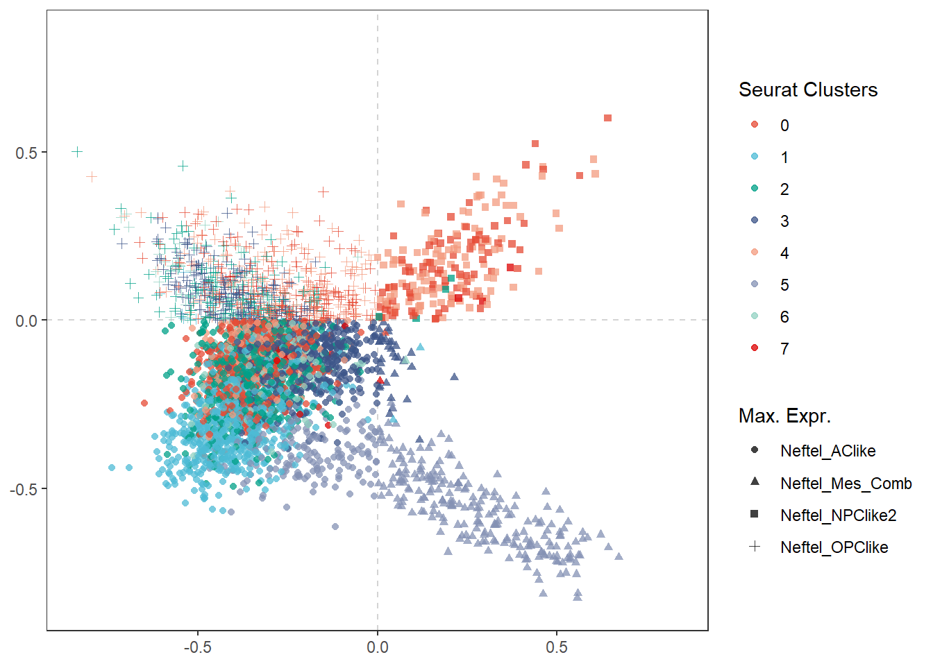
Figure 1.2 The barcode spots relocated according to their differentation.
# Surface plot in comparison (compare with Figure 1.1)
plotSurface(object = spata_obj, color_to = "seurat_clusters", pt_clrp = "npg")
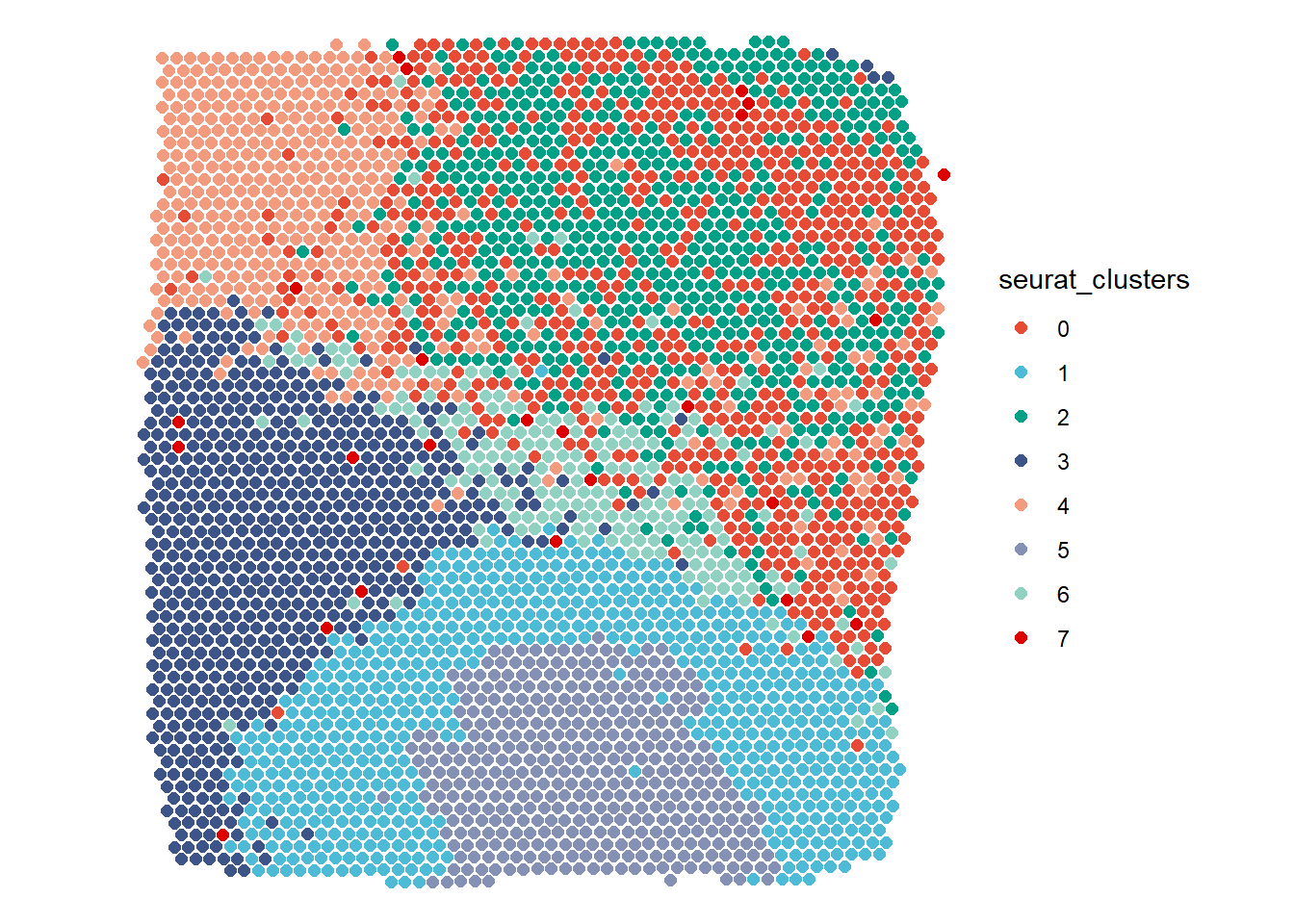
Figure 1.2 The barcode spots relocated according to their differentation.
Example 2 - Handling Spatial Trajectories
The loaded spata-object contains spatial-expression data about a brain slice going through all 6 cortical layers of the central nervous system (CNS-layers). Additionally it contains a spatial trajectory that we have drawn with createTrajectories() through all those layers and therefore called cns-layers. According to Seurat’s clustering algorithm the barcode-spots cluster together in an expected way - representing the CNS-layers - as shown in the figures below.
plotSurface(spata_obj_cns, color_to = "seurat_clusters", pt_clrp = "npg")

plotTrajectory(spata_obj_cns,
               trajectory_name = "cns-layers",
               color_to = "seurat_clusters",
               display_image = FALSE,
               pt_alpha = 0.4,
               pt_clrp = "npg",
               sgmt_size = 1.5) +
  theme(legend.position = "none")
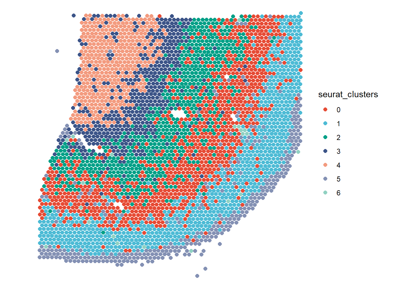
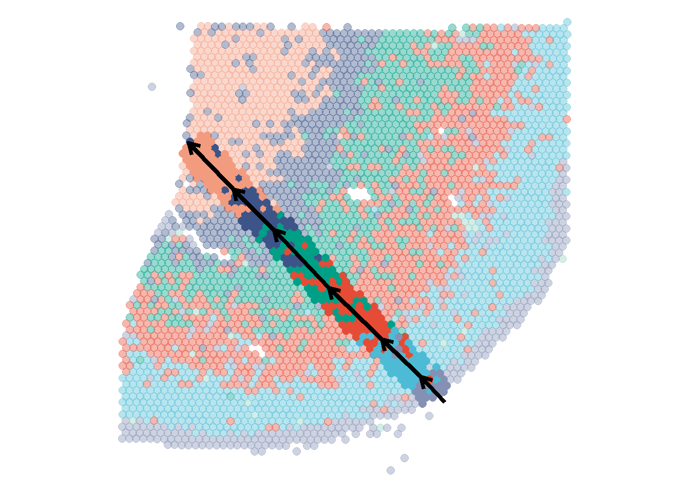
Figure 2.1 A trajectory drawn through all cortical layers of the central nervous system
Let’s try and give our data a directional component using basic functions of the tidyverse.
1. Extracting data
At first we need to extract the respective data from our spata-object and join it with the information we need. A compiled trajectory data.frame contains information about the position of barcode-spots with respect to the trajectory of interest.
cns_trajectory <- getTrajectoryObject(spata_obj_cns, trajectory_name = "cns-layers")

compiled_trajectory_df <- cns_trajectory@compiled_trajectory_df

# output
compiled_trajectory_df
2. Join with information
We are interested to work with the seurat-clusters information and we therefore need to join our data.frame with this variable. Although compiled_trajectory_df already contains variables (whoose meaning we explain down below) it still contains the variables barcodes and sample and it is thus a perfectly valid input for argument spata_df of the joinWith()-function.
joined_df <- joinWith(spata_obj_cns, spata_df = compiled_trajectory_df, features = "seurat_clusters")

# output
joined_df
3. Apply dplyr::mutate()
The variable projection_length refers to the distance between a barcode-spot’s orthogonal projection onto the trajectory and the beginning of the trajectory. Rounding these projection-length values with a given accuracyeffectively bins the barcode-spots in small groups according to their position of the trajectory’s progress. dplyr::mutate() comes in handy to easily create two new variables.
plot_df <-
  mutate(.data = joined_df,
                order_binned = plyr::round_any(x = projection_length, accuracy = 5, f = floor),
                trajectory_order = stringr::str_c(trajectory_part, order_binned, sep = "_"))

# output
plot_df
4. Plotting with ggplot2
The functions applied did not change the fact that an observation in plot_df still refers to a barcode spot and the variables of the data.frame still refer to the information we have about each barcode-spot.
ggplot(data = plot_df) +
  geom_bar(mapping = aes(x = trajectory_order, fill = seurat_clusters), position = "fill", width = .9) +
  scale_color_add_on(aes = "fill", clrp = "npg", variable = "discrete") +
  theme_minimal() +
  theme(
    axis.text.x = element_blank(),
    axis.ticks.x = element_blank(),
    axis.line.x = element_line(arrow = arrow(length = unit(0.1, "inches"))),
    panel.grid = element_blank(),
    legend.position = "bottom"
  ) +
  labs(x = "Trajectory Direction",
                y = NULL,
                fill = "Seurat Clusters")
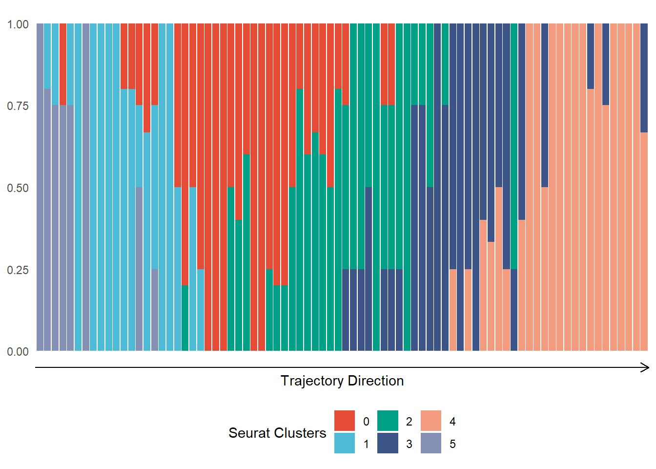
Figure 2.2 Distribution of cluster belonging along the CNS-trajectory
5. Continue analysis and plotting
Once extracted our data.frame can be expanded infinitely. While you can leverage all you programming skills within or outside of the tidyverse SPATA offers a variety of plotting functions that work with extracted, customized data.frames - usually denoted with a 2-suffix.
genes_of_interest <- c("HOPX", "OLIG1", "GFAP", "CCK")

df_with_genes <-
  joinWith(spata_obj_cns, spata_df = plot_df, genes = genes_of_interest) %>%
  select(-order_binned, -projection_length)#discard currently useless variables


plotDistributionAcross2(df = filter(df_with_genes, trajectory_part %in% c("Part 1", "Part 2", "Part 3")),
                        variables = "all", # gene variables are the only numeric variables left
                        across = "seurat_clusters",
                        clrp = "npg") +
  theme(legend.position = "top") +
  labs(caption = "First three parts of trajectory")

plotDistributionAcross2(df = filter(df_with_genes, trajectory_part %in% c("Part 4", "Part 5", "Part 6")),
                        variables = "all", # gene variables are the only numeric variables left
                        across = "seurat_clusters",
                        clrp = "npg") +
  theme(legend.position = "top") +
  labs(caption = "Last three parts of trajectory")
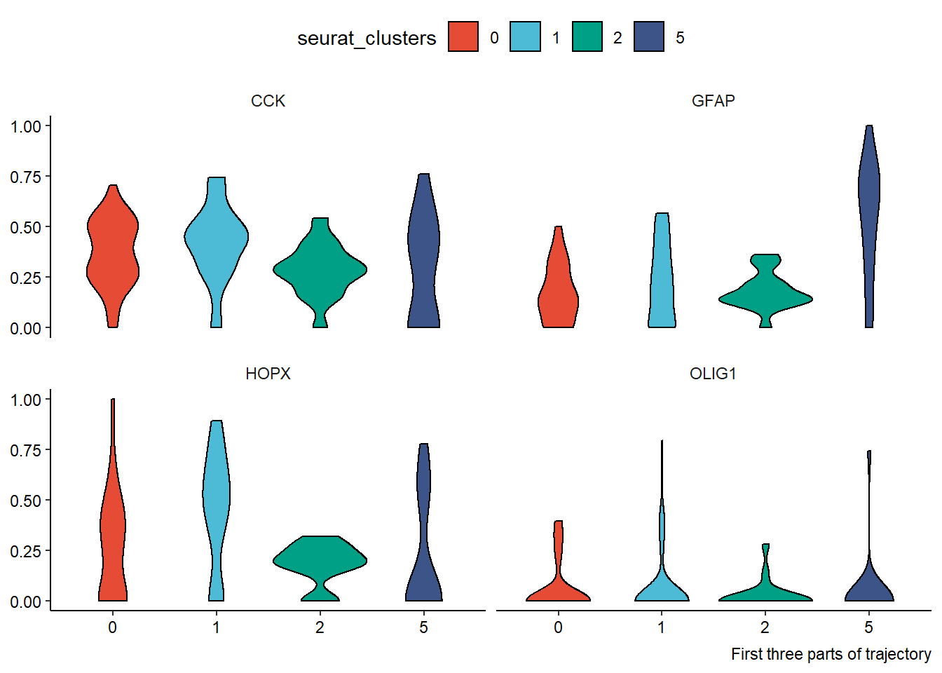
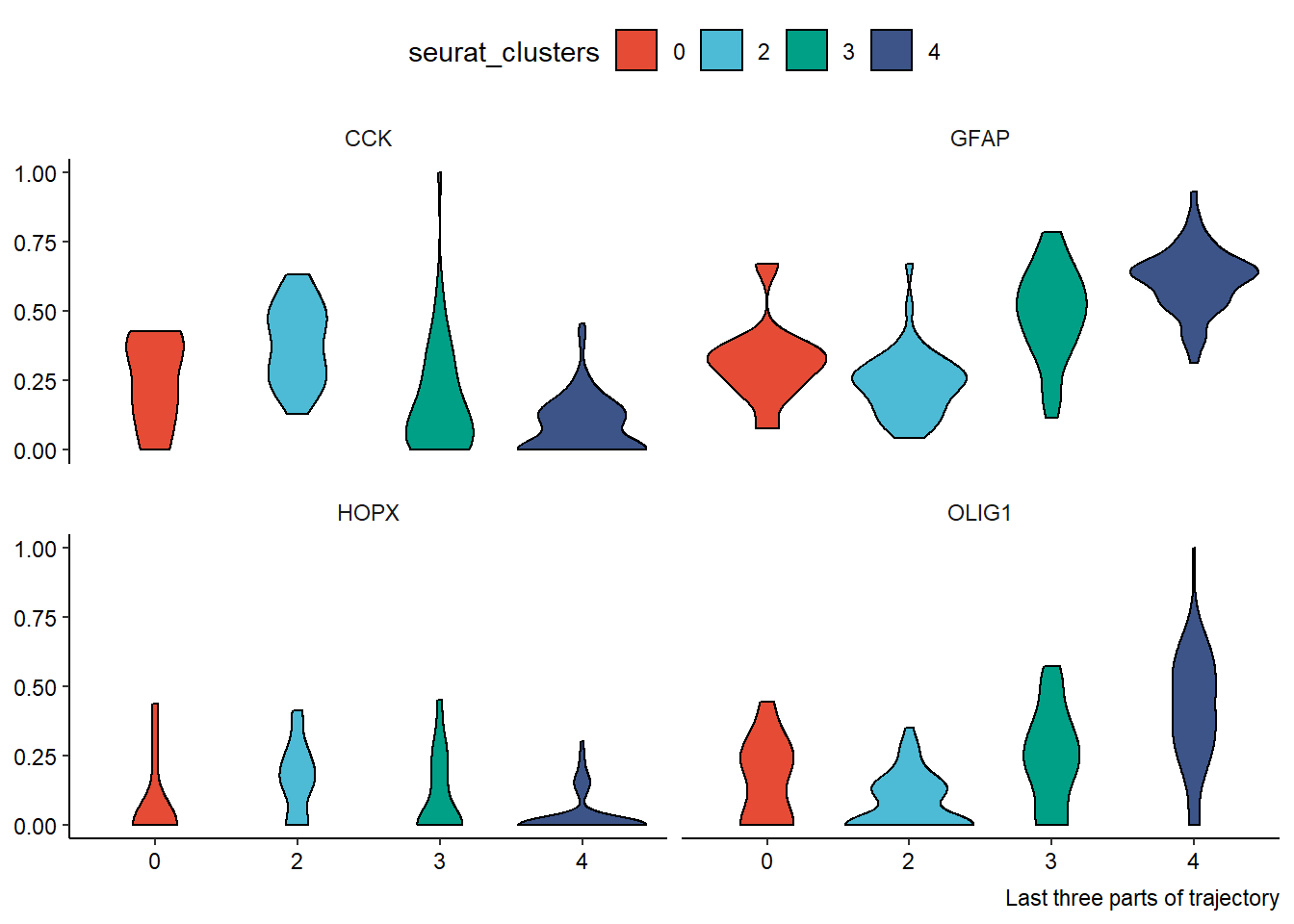
Figure 2.3 Easy application of dplyr’s select() and filter()