Plotting with SPATA
spata-plotting.RmdThe majority of SPATA-functions that visualize results return a ggplot-object that can be customized subsequently according to the rules of the ggplot2-framework. Throughout this tutorials we demonstrate just that by tweaking the presented plots via ggplot2::labs(), SPATA::scale_color_add_on() and ggplot2::theme().
Several functions come in twofold. The original function takes the spata-object and creates whatever is necessary from scratch. This can sometimes be time consuming or at least more time consuming than using the second version of that function - denoted with a 2 behind it. These plotting functions take a data.frame as input and apply the plotting code of function 1 to it. Compatible data.frames can be obtained following these instructions.
As example samples we are using healthy cortex as well as glioblastoma-tissue in alternation.
# load packages
library(SPATA)
library(magrittr)
library(ggplot2)

# ggplot2 plots can be easily combined with 'patchwork'
library(patchwork)

# load object
spata_obj <- loadSpataObject(input_path = "data/spata-obj-plotting-example.RDS")
Plot surface
Basic surface plots one by one
Surface plotting allows to visualize the barcode-spots information with a spatial dimension. Behind the scenes they are scatterplots whereby the x-aesthetic and y-aesthetic of the plot is mapped onto the respective coordinate-variable.
# plot a cluster feature
p1 <-
  plotSurface(object = spata_obj,
              of_sample = "265_C",
              color_to = "seurat_clusters",
              pt_clrp = "npg",
              pt_size = 1.5) + labs(color = "Clusters")

# plot gene-set expression
p2 <-
  plotSurface(object = spata_obj,
              of_sample = "265_C",
              color_to = "CARTPT",
              pt_size = 1.5,
              pt_clrsp = "magma")

# combine with patchwork
p1 + theme(legend.position = "top") +
 p2 + theme(legend.position = "top") # relocate the legend as the gene set name is long
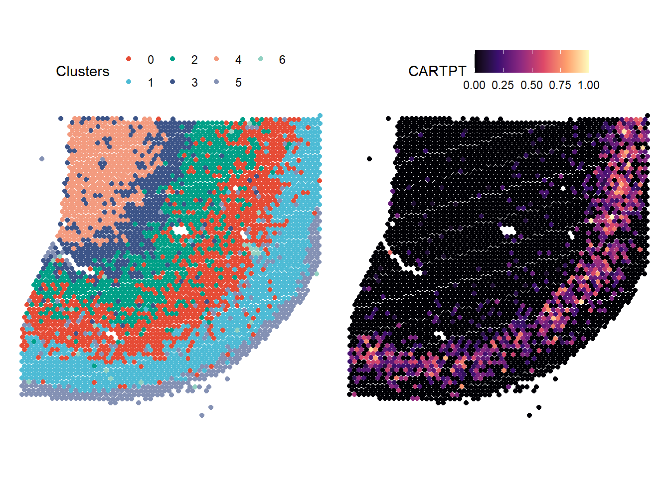
Figure 1.1. Basic surface plots
The data.frame below shows the underlying data.frame. Note that two different variables were used with respect to the color-aesthetic.
Mapping continuous features on to the color-aesthetic is not always insightful, in particular if the plot is crowded - which is the case for every spatial-transcriptomic plot. In order to visualize the underlying pattern as well as to make the plot more aesthetically pleasing you can use the smooth-arguments.
# plot gene-set expresson
p1 <-
  plotSurface(object = spata_obj,
              color_to = "CARTPT",
              pt_size = 1.6,
              pt_clrsp = "magma")

# plot gene-set expression (spatially smoothed)
p2 <-
  plotSurface(object = spata_obj,
                color_to = "CARTPT",
                pt_size = 1.6,
                pt_clrsp = "magma",
                smooth = TRUE,
                smooth_span = 0.01)

# combine with patchwork
p1 +
  theme(legend.position = "none") +
p2 +
  theme(legend.position = "top")
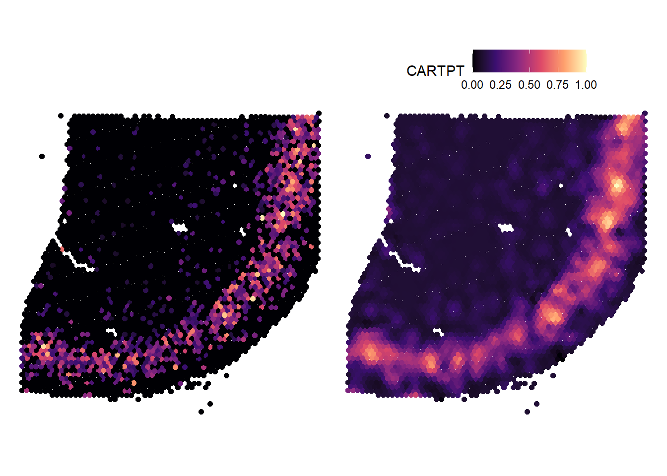
Figure 1.2. Not smoothed and smoothed surface plots in contrast
Surface plots interactive
Another more convenient way is to use plotSurfaceInteractive() which let’s you plot your figures interactively and way quicker. It returns a named list of all plots saved during your plotting session.
# open mini-app to obtain a list of plots
plots <- plotSurfaceInteractive(spata_obj)
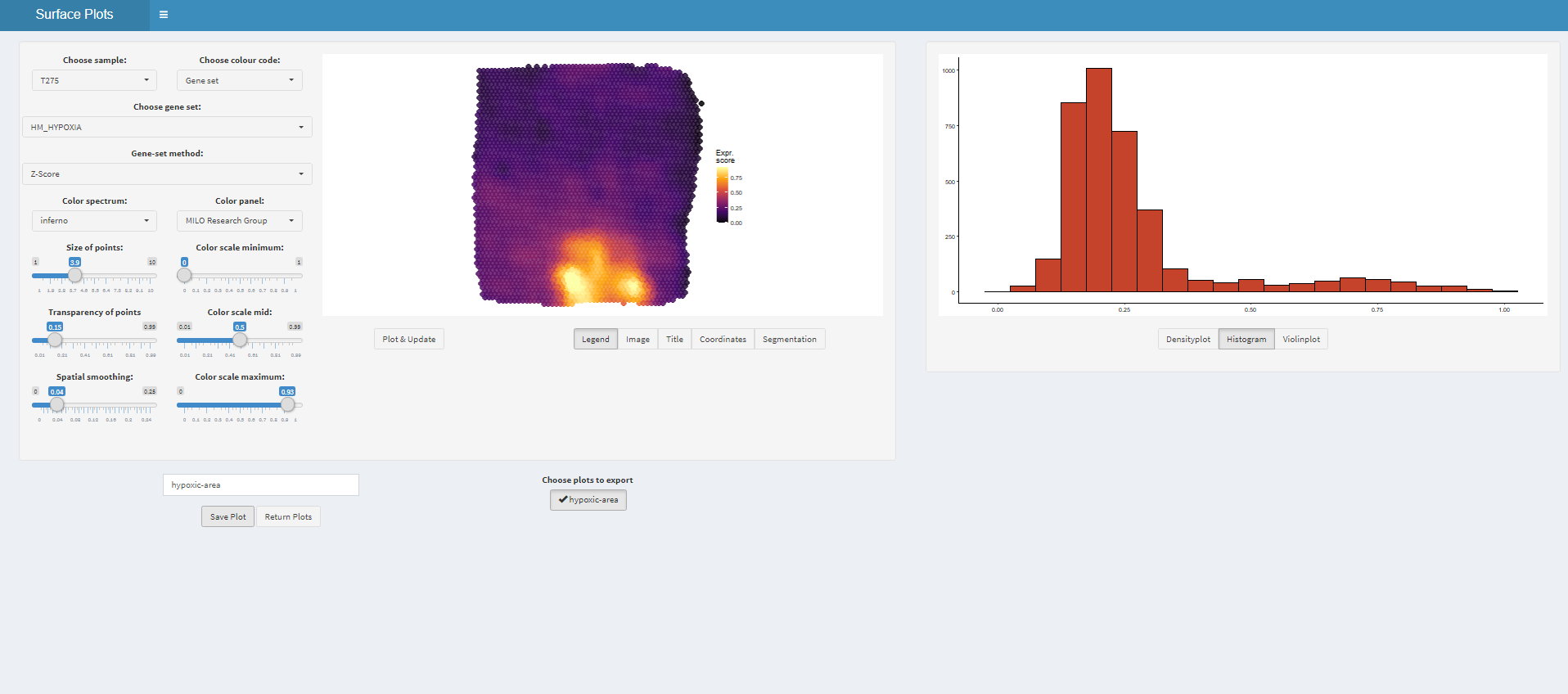
Figure 1.3. The interface of plotSurfaceInteractive()
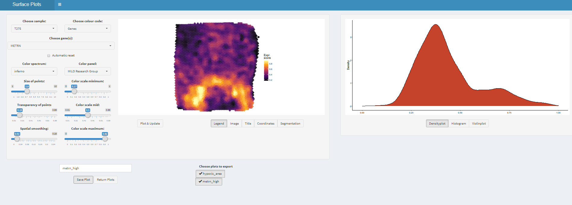
Figure 1.3. The interface of plotSurfaceInteractive()
# get plot names
names(plots)
## [1] "hypoxic_area" "metrn_high"# plot plots from returned list # treat and post-process them like every other ggplot-object plots$hypoxic_area + labs(title = "Hypoxic Area") + theme(legend.position = "none") + plots$metrn_high + labs(title = "Formation of Axonal Networks (METRN)")
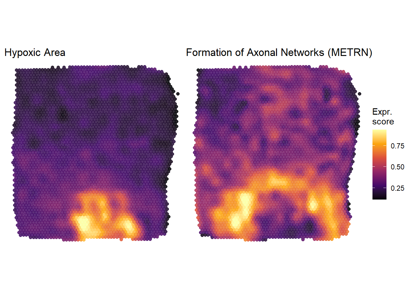
Figure 1.4. Plots derived from plotSurfaceInteractive()
Surface plots in comparison
In order to quickly compare the spatial distribution of a set of variables of the same kind use plotSurfaceComparison().
plotSurfaceComparison(object = spata_obj,
                      variables = c("CARTPT", "OLIG1", "GFAP", "SYNPR", "HOPX", "CCK"),
                      smooth = TRUE,
                      smooth_span = 0.02,
                      pt_size = 1,
                      pt_clrsp = "inferno")
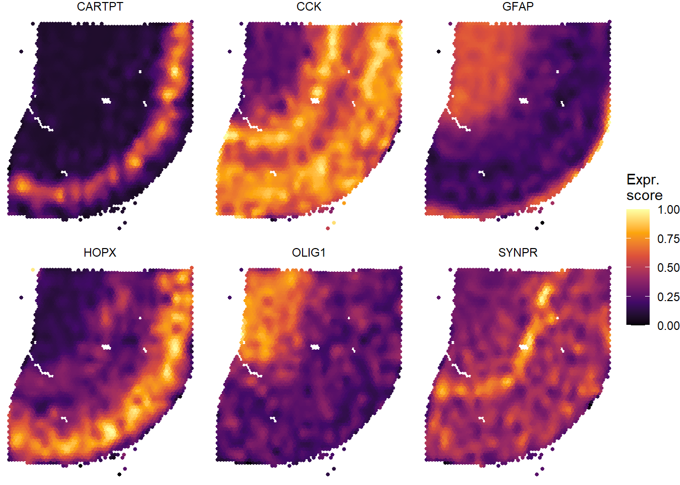
Figure 1.5. A quick way to compare several variables
Plot distribution
In order to plot the distribution of a set of variables for a sample you can use the plotDistribution()-family.
Distribution of continuous variables
Gene- and gene-set expression as well as numeric features are continuous variables whoose distribution within the sample or/and across subgroups is often of interest. Use the plotDistribution()-family.
For the whole sample
genes_of_interest <- c("CARTPT", "OLIG1", "GFAP", "SYNPR", "HOPX", "CCK")


# e.g. violinplot
  plotDistribution(spata_obj,
                   variables = genes_of_interest,
                   plot_type = "violin")  # adjust layout to compensate for long gene set names
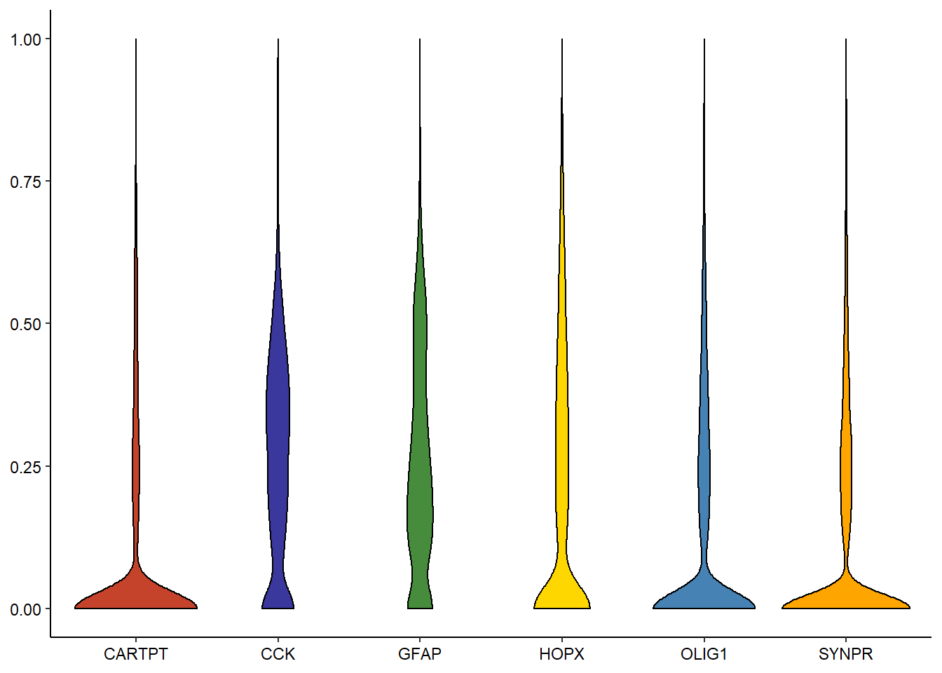
Figure 2.1. Several ways to display variable-distribution.
# e.g. density
  plotDistribution(spata_obj,
                   variables = genes_of_interest,
                   plot_type = "density")
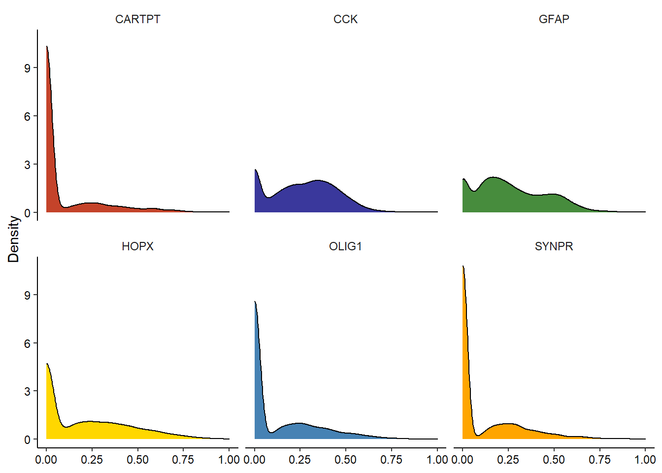
Figure 2.2. Several ways to display variable-distribution.
Across subgroups
In order to compare the distribution of certain variables accross categorical features (such as clusters or spatial segmentation) use plotDistributionAcross(). Here we are interested in the distribution of values across the different clusters the barcode-spots were assigned to according to the algorithm used by the Seurat-package.
(If your object contains several samples the feature sample is such a barcode-spots grouping, categorical feature and therefore a valid input for the across-argument which would then compare the distribution of values across samples.)
# e.g. violinplot
plotDistributionAcross(object = spata_obj,
                       variables = genes_of_interest[1:3],
                       across = "seurat_clusters",
                       plot_type = "violin",
                       clrp = "npg",
                       ncol = 1) +
  theme(legend.position = "none")


# for understanding purpose

plotSurface(object = spata_obj,
            color_to = "seurat_clusters",
            pt_clrp = "npg") +
  theme(legend.position = "top") +
  labs(color = "Seurat Clusters")
-1-1.png)
-1-2.png)
Figure 2.3. Display variable-distribution across categorical subgruops
# e.g. ridgeplot
plotDistributionAcross(object = spata_obj,
                       variables = genes_of_interest[1:4],
                       across = "seurat_clusters",
                       plot_type = "ridgeplot",
                       nrow = 2) +
  theme(legend.position = "none")
-2-1.png)
Figure 2.4. Display variable-distribution across categorical subgruops
Distribution of discrete features
Discrete (syn. categorical) features are those who effectively group barcode-spots into subgroups. It might be of interest how much these grouping variables overlap. (findMonocleClusters() is a convenient way to iterate over several clustering algorithms at the same time and to obtain different, computationally produced ways to separate your sample.)
plotSurface(object = spata_obj, color_to = "cluster_leiden_UMAP_k5", pt_clrp = "jama", pt_size = 1.5) +
  theme(legend.position = "top") + labs(color = "Leiden Clusters") +
plotSurface(object = spata_obj, color_to = "seurat_clusters", pt_clrp = "npg", pt_size = 1.5) +
  theme(legend.position = "top") + labs(color = "Seurat Clusters")
-1-1.png)
Figure 2.5 Spatial visualization of two different clustering results
The pattern looks similar and both algorithms returned 6 different clusters. But in how far they overlap is hard to quantify by eye in overcrowded scatterplots. Use plotDistributionDiscrete() to compare two of those grouping results and to see how they overlap.
plotDistributionDiscrete(object = spata_obj,
                         features = c("cluster_leiden_UMAP_k5", "cluster_leiden_tSNE_k5"),
                         feature_compare = "seurat_clusters",
                         position = "fill",
                         clrp = "npg") +
  labs(fill = "Seurat Clusters")
-2-1.png)
Figure 2.6 Display discrete variable distribution with basic barplots.
(Several clustering algorithms return numbers as names for the groups they assigned the barcode-spots to. These are rarely informative. If your DE-analysis via e.g. findDE() returned results according to which you would like to name the respective subgroups use renameSubgroups().)
Plot dimensional reduction
Currently SPATA supports the plotting of UMAP- and of TSNE-data.
# load tumor object
spata_obj <- loadSpataObject("data/spata-obj-plotting-example-tumor.RDS")
plotUMAP(spata_obj, color_to = "seurat_clusters", pt_alpha = 0.8) +
  theme(legend.position = "none") +
  labs(color = "Seurat Clusters",
       caption = "UMAP")

plotTSNE(spata_obj, color_to = "seurat_clusters", pt_alpha = 0.8) +
  theme(legend.position = "top") +
  labs(color = "Seurat Clusters",
       caption = "TSNE")
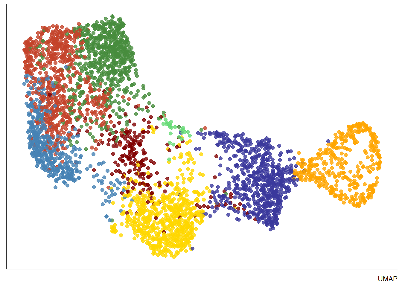
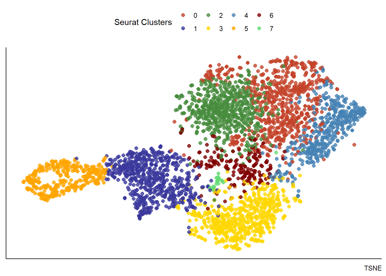
Figure 3.1. Visualization of dimensional reduction
Plot cellular states
In order to compare expression levels of genes and gene-sets across barcode-spots you can use a variety of tools. One is color in a spatial context as the plotSurfaceComparison() exemplifies. It compares the expression of variables by color.
# e.g. Neftel et al. 2019 suggested a new classification of tumor cells in glioblastoma multiforme
#     The genes that define these states are stored in gene sets.
four_states <- c("Neftel_OPClike", "Neftel_NPClike2", "Neftel_AClike", "Neftel_Mes_Comb")

plotSurfaceComparison(spata_obj,
                      variables = four_states,
                      pt_size = 1.5,
                      smooth = TRUE,
                      pt_clrsp = "inferno") + theme(legend.position = "none")
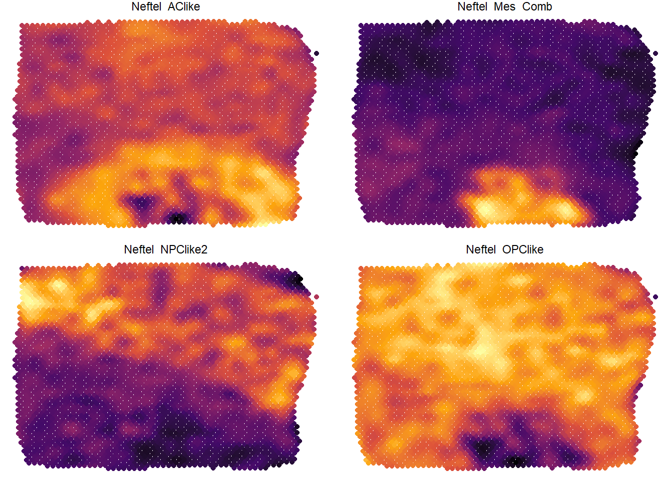
Figure 3.2. Comparison of expression levels by color
See Genes, Gene-sets & Features to learn how to set up your personally defined gene-sets (or states for that matter). plotFourStates() compares the expression of variables mathematically. It calculates the expression levels of four defined gene-sets for every barcode-spot and assign a position to every barcode.
plotFourStates(object = spata_obj,
               states = four_states,
               method_gs = "mean",
               # using color here to underline that the mathematical algorithm is valid
               color_to = "Neftel_Mes_Comb",
               pt_alpha = 0.75,
               pt_size = 1) + theme(legend.position = "none")
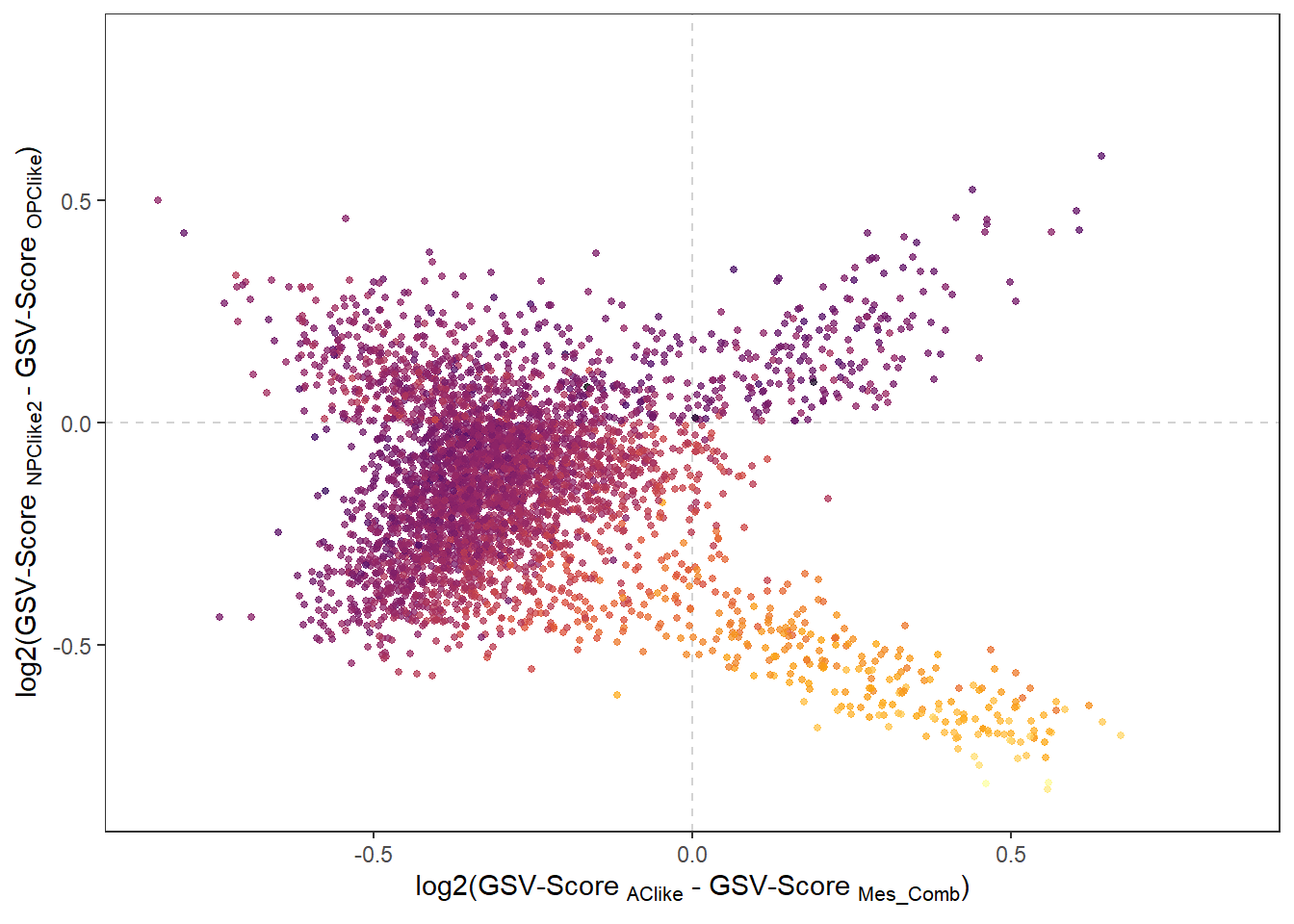
Figure 3.3. Comparison of expression levels by applying maths
Plot spatial trajectories
To learn how to draw, plot and analyze spatial trajectories click here.
Plot differentially expressed genes
To learn how to find, plot and analyze differential gene expression as well as sample segmentation click here.