Prerequisites
Make sure to be familiar with the following tutorials before proceeding:
1. Introduction
Statistic related plots are indispensable in proper data analysis. cypro offers functions for all established plot types. This tutorial guides you through all of them and explains how their most important arguments work.
2. Numeric variables
Statistical plotting functions that handle continuous numeric data variables are split in two sub groups.
- Plots that allow for visualization of statistical tests. (Boxplot & Violinplot)
- Plots that do not allow for visualization of statistical tests. (Histogram, Densityplot & Ridgeplot)
Throughout this section we visualize the differences in shape related data variables.
# all area related variables
getStatVariableNames(object, starts_with("AreaShape"))
output
##  [1] "AreaShape_Area"                 "AreaShape_BoundingBoxArea"
##  [3] "AreaShape_BoundingBoxMaximum_X" "AreaShape_BoundingBoxMaximum_Y"
##  [5] "AreaShape_BoundingBoxMinimum_X" "AreaShape_BoundingBoxMinimum_Y"
##  [7] "AreaShape_Center_X"             "AreaShape_Center_Y"
##  [9] "AreaShape_Compactness"          "AreaShape_Eccentricity"
## [11] "AreaShape_EquivalentDiameter"   "AreaShape_EulerNumber"
## [13] "AreaShape_Extent"               "AreaShape_FormFactor"
## [15] "AreaShape_MajorAxisLength"      "AreaShape_MaxFeretDiameter"
## [17] "AreaShape_MaximumRadius"        "AreaShape_MeanRadius"
## [19] "AreaShape_MedianRadius"         "AreaShape_MinFeretDiameter"
## [21] "AreaShape_MinorAxisLength"      "AreaShape_Orientation"
## [23] "AreaShape_Perimeter"            "AreaShape_Solidity"
## [25] "AreaShape_Zernike_0_0"          "AreaShape_Zernike_1_1"
## [27] "AreaShape_Zernike_2_0"          "AreaShape_Zernike_2_2"
## [29] "AreaShape_Zernike_3_1"          "AreaShape_Zernike_3_3"
## [31] "AreaShape_Zernike_4_0"          "AreaShape_Zernike_4_2"
## [33] "AreaShape_Zernike_4_4"          "AreaShape_Zernike_5_1"
## [35] "AreaShape_Zernike_5_3"          "AreaShape_Zernike_5_5"
## [37] "AreaShape_Zernike_6_0"          "AreaShape_Zernike_6_2"
## [39] "AreaShape_Zernike_6_4"          "AreaShape_Zernike_6_6"
## [41] "AreaShape_Zernike_7_1"          "AreaShape_Zernike_7_3"
## [43] "AreaShape_Zernike_7_5"          "AreaShape_Zernike_7_7"
## [45] "AreaShape_Zernike_8_0"          "AreaShape_Zernike_8_2"
## [47] "AreaShape_Zernike_8_4"          "AreaShape_Zernike_8_6"
## [49] "AreaShape_Zernike_8_8"          "AreaShape_Zernike_9_1"
## [51] "AreaShape_Zernike_9_3"          "AreaShape_Zernike_9_5"
## [53] "AreaShape_Zernike_9_7"          "AreaShape_Zernike_9_9"
# selected ones whose properties make sense to be compared against each other
vars_of_interest <-
  getStatVariableNames(
    object = object,
    starts_with("AreaShape") &
      contains(c("Max", "Min", "Mean", "Median", "Solidity", "Ecc")) &
      -contains("Bounding")
    )

vars_of_interest
output
## [1] "AreaShape_Eccentricity"     "AreaShape_MaxFeretDiameter"
## [3] "AreaShape_MaximumRadius"    "AreaShape_MeanRadius"
## [5] "AreaShape_MedianRadius"     "AreaShape_MinFeretDiameter"
## [7] "AreaShape_MinorAxisLength"  "AreaShape_Solidity"
2.1 Histograms & Densityplots
Use the functions plotHistogram() and plotDensityplot() to visualize each.
# basic densityplot
plotDensityplot(object, variables = vars_of_interest[1:4])

# plot histogram
plotHistogram(object, variables = vars_of_interest[5:8], clrp = "jco")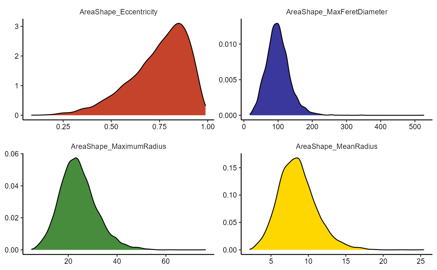
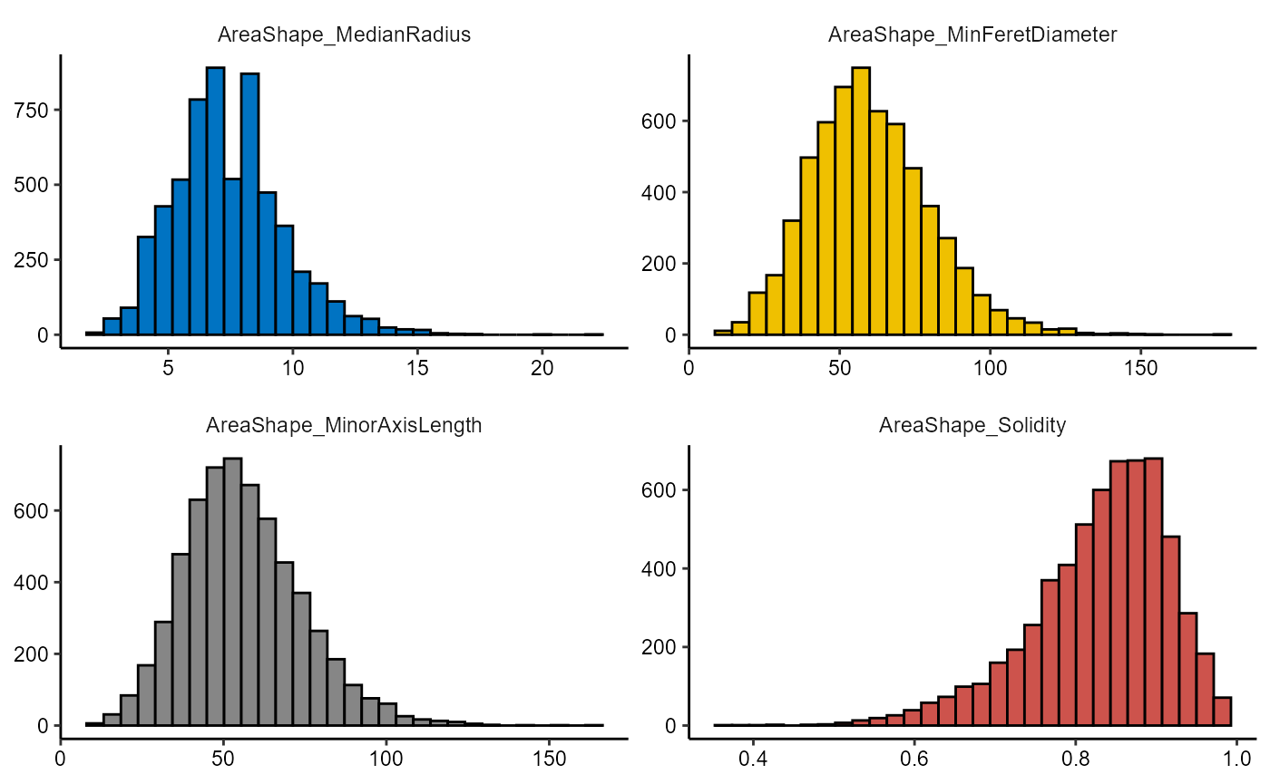
Figure 2.1 Basic densityplots and histograms.
Both functions can be used in a comparative manner by specifying a grouping variable via the across argument.
getGroupingVariableNames(object)output
## [1] "cell_line"        "condition"        "concentration"    "moa"
## [5] "well_plate_name"  "well_plate_index" "well"             "well_roi"
getGroupNames(object, grouping_variable = "condition")output
## [1] "anisomycin"    "AZ258"         "cyclohexamide" "DMSO"
## [5] "mitomycin C"   "taxol"
conds_of_interest <- c("DMSO", "AZ258", "taxol", "mitomycin C")
# histograms are not suited for comparative plotting
plotHistogram(
  object = object,
  variable = vars_of_interest[1:4],
  across = "condition",
  across_subset = conds_of_interest,
  relevel = TRUE,
  clrp = "npg" # change colorpanel as color now refers to groups
  ) + legendBottom()

# densityplots have their drawbacks, too
plotDensityplot(
  object = object,
  variable = vars_of_interest[1:4],
  across = "condition",
  across_subset = conds_of_interest,
  relevel = TRUE,
  clrp = "npg", # change colorpanel as color now refers to groups
  alpha = 0.75 # increase transperancy
  ) + legendBottom()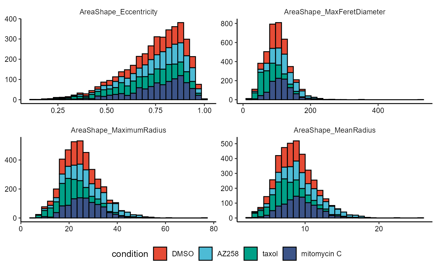
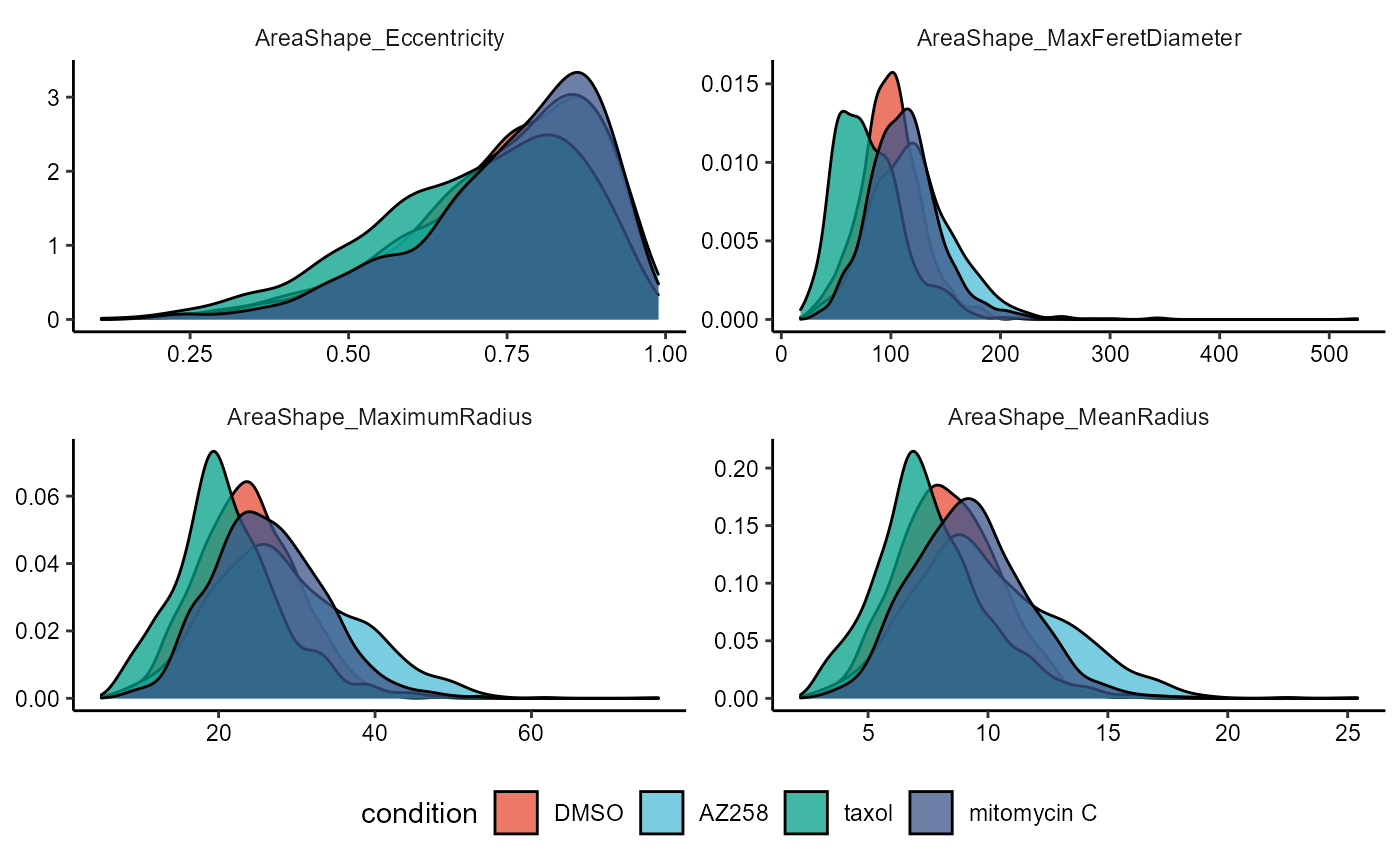
Figure 2.2 Distributions across a condition, suboptimal choice of plots
2.2 Ridgeplots
To plot continuous variables in a comparative manner while using the style of densityplots we recommend ridgeplots, accesible through the function plotRidgeplot().
# first four vars
plotRidgeplot(
  object = object,
  variable = vars_of_interest[1:4],
  across = "condition",
  across_subset = conds_of_interest,
  relevel = TRUE,
  clrp = "npg"
  ) + legendNone()

# last four vars
plotRidgeplot(
  object = object,
  variable = vars_of_interest[5:8],
  across = "condition",
  across_subset = conds_of_interest,
  relevel = TRUE,
  clrp = "npg"
  ) + legendNone()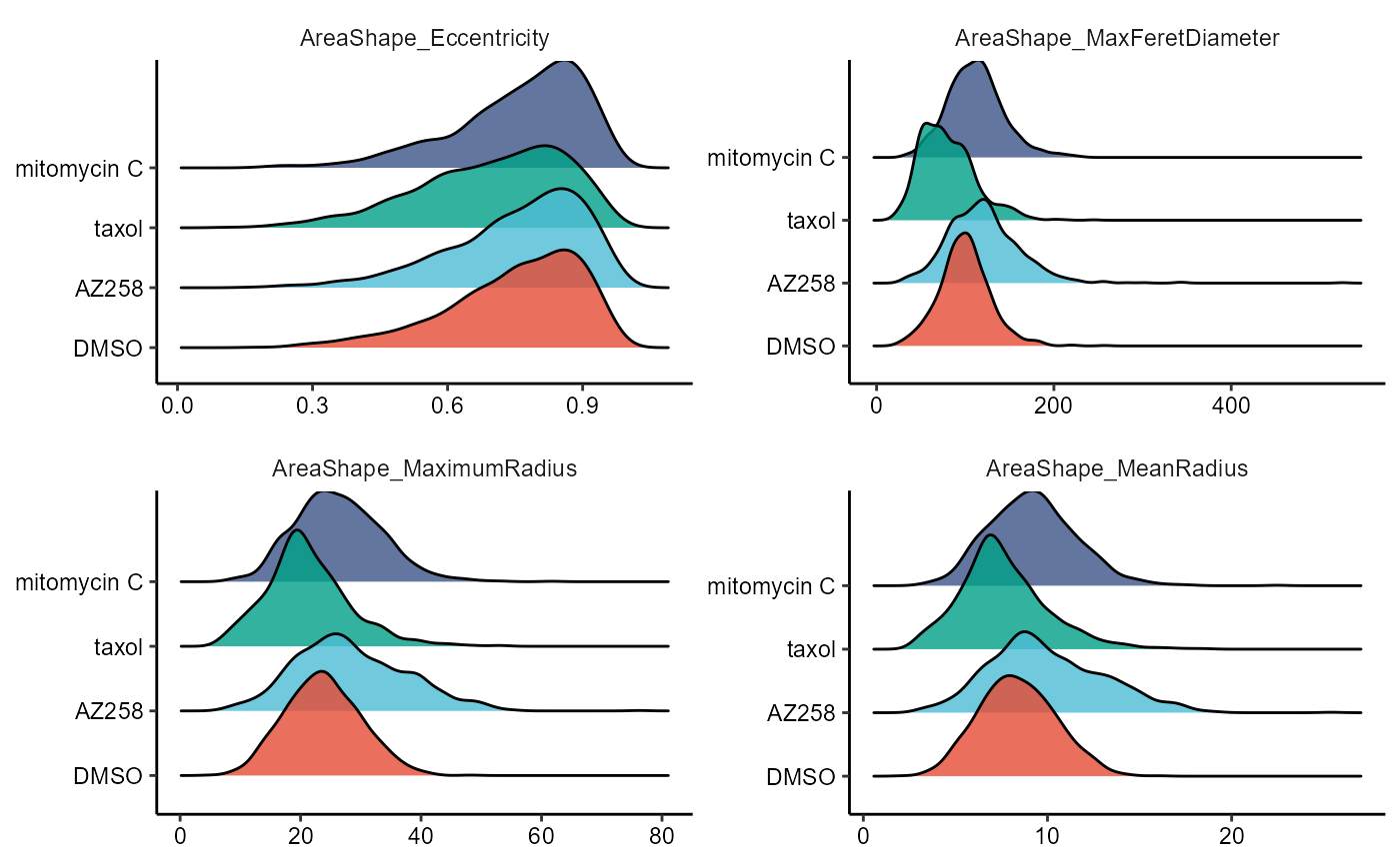
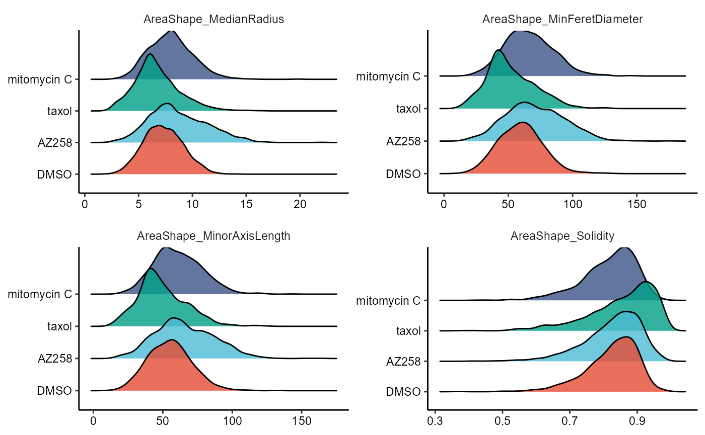
Figure 2.3 Ridgplots to compare across cell groups
2.3 Boxplots and Violinplots
Each plot comes with its own respective function, namely plotBoxplot() and plotViolinplot().
# first four vars
plotBoxplot(
  object = object,
  variable = vars_of_interest[1:4],
  across = "condition",
  across_subset = conds_of_interest,
  relevel = TRUE,
  display_points = TRUE,
  pt_size = 1,
  pt_shape = 19,
  clrp = "npg"
  ) + legendNone()

# last four vars
plotViolinplot(
  object = object,
  variable = vars_of_interest[5:8],
  across = "condition",
  across_subset = conds_of_interest,
  relevel = TRUE,
  clrp = "npg"
  ) + legendNone()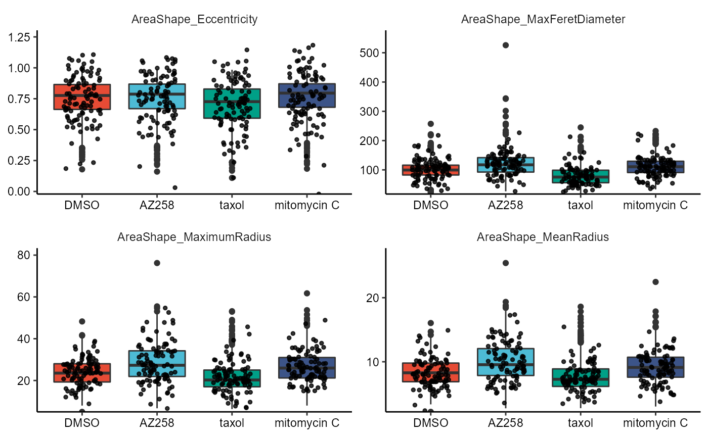

Figure 2.4 Boxplots and violinplots
Statistical tests can either be performed pairwise (e.g. t-test) or groupwise (e.g. anova). The respective arguments are named accordingly.
# first four vars
plotBoxplot(
  object = object,
  variable = vars_of_interest[1:4],
  across = "condition",
  across_subset = conds_of_interest,
  test_pairwise = "t.test",
  ref_group = "DMSO",
  step_increase = 0.2, # adjust the p-value bar hight
  clrp = "npg"
  ) + legendNone()

# last four vars
plotViolinplot(
  object = object,
  variable = vars_of_interest[5:8],
  across = "condition",
  across_subset = conds_of_interest,
  test_groupwise = "anova",
  clrp = "npg"
  ) + legendNone()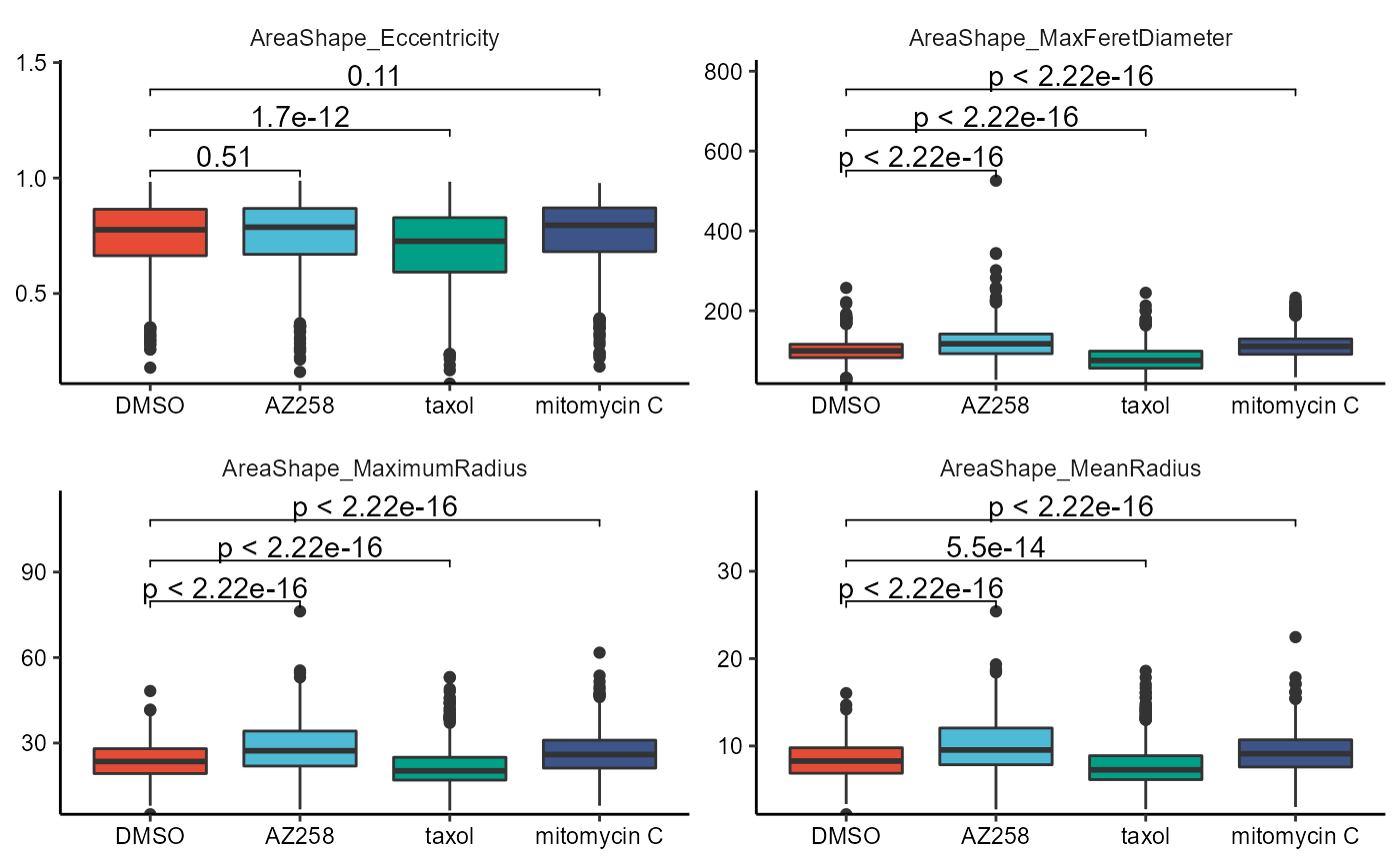
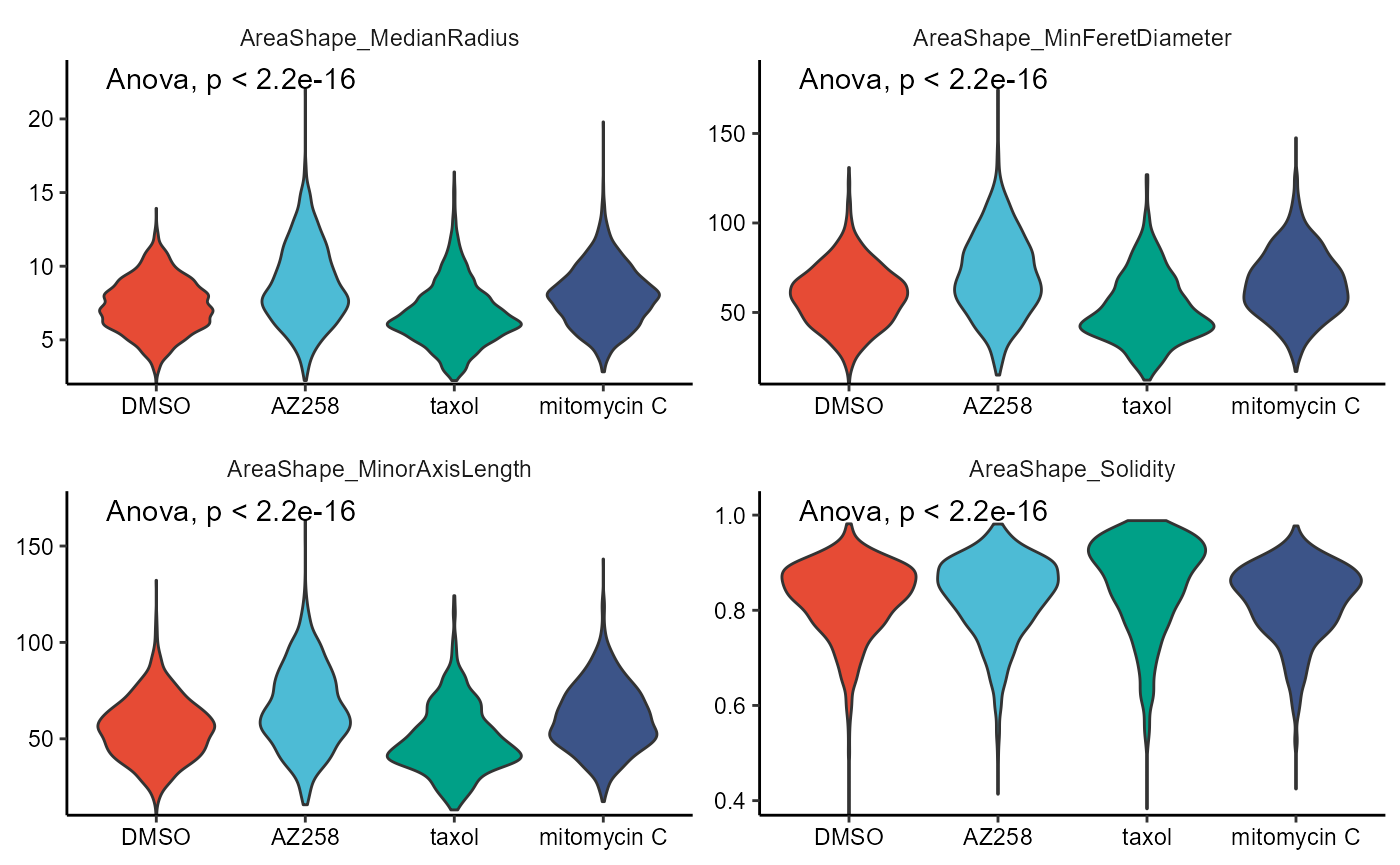
Figure 2.5 Boxplots and violinplots with t-test and anova.
3. Grouping variables
The function plotBarchart() provides options to visualize categorical data variables.
# visualize counts
count_plot <-
  plotBarchart(
    object = object,
    variables = "condition",
    position = "stack" # stack -> absolute numbers
    ) + coord_flip() +
  plotBarchart(
    object = object,
    variables = "well_plate_name",
    position = "stack"
  ) + coord_flip()

# visualize proportions with argument 'across'
prop_dodge <-
  plotBarchart(
    object = object,
    variables = "condition",
    across = "pam_euclidean_k_4_(intensity)",
    position = "dodge"
  ) + coord_flip()

prop_fill <-
  plotBarchart(
    object = object,
    variables = "condition",
    across = "pam_euclidean_k_4_(intensity)",
    position = "fill"
  ) + coord_flip()


# combine with patchwork
count_plot / (prop_dodge + prop_fill)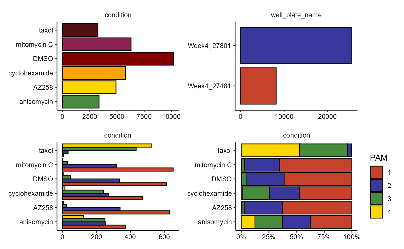
Figure 3.1 Visualize categorical data variables.
4. Interactive plotting
The function plotStatisticsInteractive() gives access to an interactive graphical user interface in which most of the functionalities introduced in Section 2 and 3 can be used interactively. Plots can be immediately exported as .PNG or .pdf files.
ploStatisticsInteractive(object)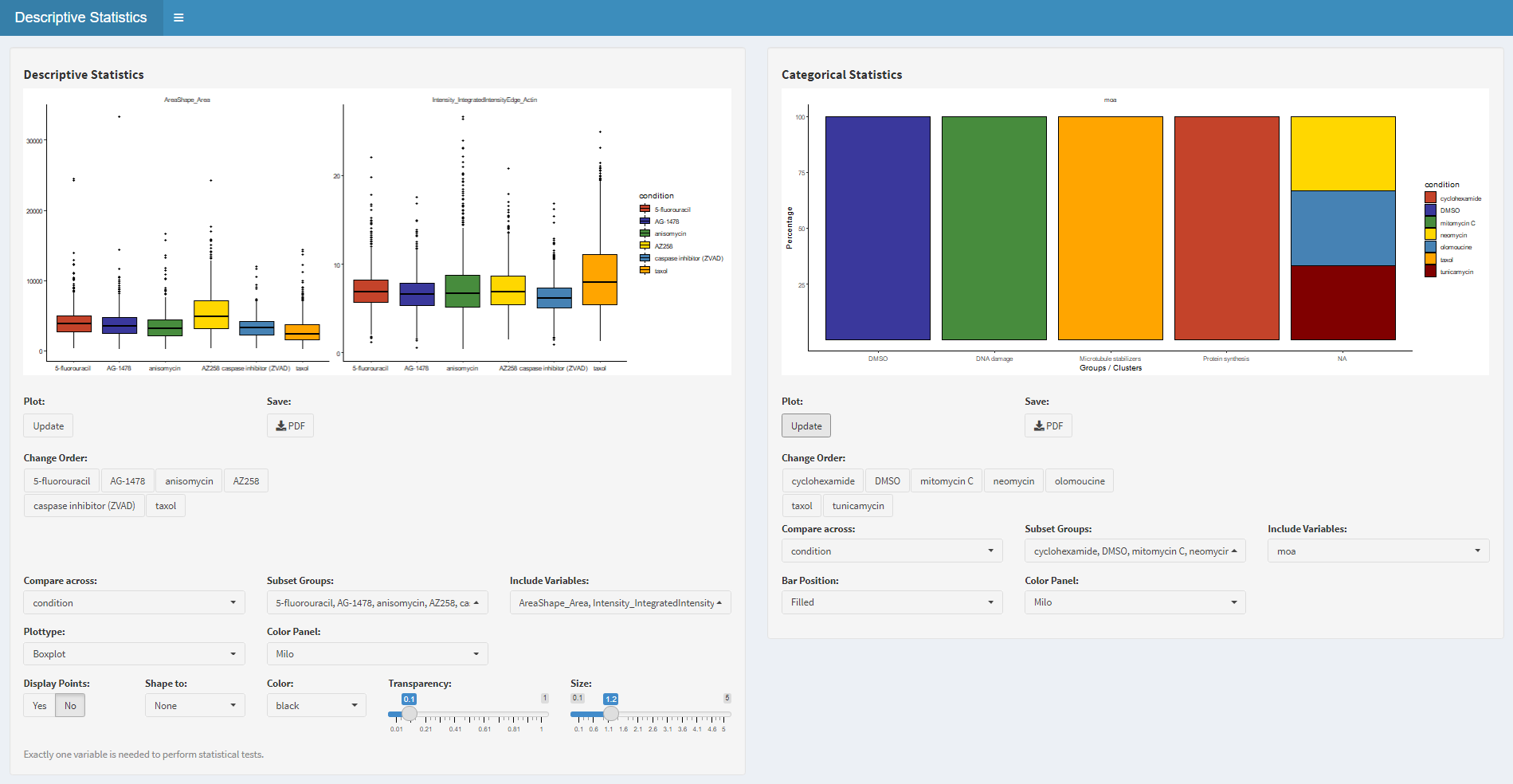
4.1 Interface of plotStatisticsInteractive()