1. Introduction
If the experiment design contains timelapse imaging and the data contains x- and y-coordinates you can make use of cypros migration module - a collection of analysis and plotting functions to quantify cellular migration. This tutorial guides you through all of them.
# load packages
library(cypro)
library(tidyverse)

# load object that contains tracking data
object <- readRDS(file = "data/example-tracks.RDS")

object
## An object of class 'cypro'.
##
## Name: tmz-ly
## Type: Time Lapse
## Number of Cells: 7987
## Conditions:
## First phase: 'Ctrl'
## Second phase: 'Ctrl', 'LY(1uM)', 'TMZ(100uM)' and 'TMZ(100uM)+LY(1uM)'
## Cell Lines: '168', '233' and 'GSC'
## Well Plates: 'one'
## No variables sets have been defined yet.The experiment design of the example cypro object contains two phases as the treatment started after the 17th frame. The well plate design looked like this.
plotWellPlate(
  object = object,
  size_well = 6,
  plot_type = "tile",
  display_labels = TRUE
  ) + legendTop()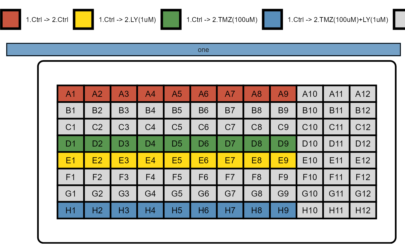
Figure 1.1 Well plate design of example cypro object.
2. Computed data variables
If x- and y-coordinates are provided in the loaded data files several migration related variables are computed based on them.
2.1 Track data
This includes all data variables the CellTracker output contains:
- Distance from origin, where for each cell the origin is the position of the cell in the first frame. (variable name: dfo)
- Distance from last point (variable name: dflp)
- Instantaneous speed, defined as the distance from the last point divided by the time elapsed between the acquisition frames (variable name: speed)
Assuming the data input files only contained x- and y-coordinates the respective track data.frame looks like this:
getTracksDf(object, phase = "all", with_grouping = FALSE)## # A tibble: 191,688 x 9
## cell_id frame_num frame_time frame_itvl x_coords y_coords speed dfo dflp
## <chr> <dbl> <dbl> <chr> <dbl> <dbl> <dbl> <dbl> <dbl>
## 1 CID_1_WI~ 1 3 3 hours 253 218 0 0 0
## 2 CID_1_WI~ 2 6 6 hours 226 211 9.30 27.9 27.9
## 3 CID_1_WI~ 3 9 9 hours 234 198 5.09 27.6 15.3
## 4 CID_1_WI~ 4 12 12 hours 231 199 1.05 29.1 3.16
## 5 CID_1_WI~ 5 15 15 hours 229 198 0.745 31.2 2.24
## 6 CID_1_WI~ 6 18 18 hours 229 190 2.67 36.9 8
## 7 CID_1_WI~ 7 21 21 hours 231 199 3.07 29.1 9.22
## 8 CID_1_WI~ 8 24 24 hours 233 200 0.745 26.9 2.24
## 9 CID_1_WI~ 9 27 27 hours 233 202 0.667 25.6 2
## 10 CID_1_WI~ 10 30 30 hours 233 202 0 25.6 0
## # ... with 191,678 more rows2.2 Statistic data
All three track variables are summarized in the statistic slot:
getStatsDf(object, with_grouping = FALSE, phase = 1) ## # A tibble: 7,987 x 21
## cell_id max_speed mean_speed median_speed min_speed sd_speed var_speed
## <chr> <dbl> <dbl> <dbl> <dbl> <dbl> <dbl>
## 1 CID_1_WI_A1_1~ 9.30 2.80 1.67 0 2.75 7.54
## 2 CID_1_WI_A1_2~ 6.47 3.15 3.33 0 1.64 2.68
## 3 CID_1_WI_A1_3~ 6.75 2.28 1.33 0 2.33 5.41
## 4 CID_1_WI_A2_2~ 4.53 0.940 0.745 0 1.06 1.13
## 5 CID_1_WI_A2_3~ 9.39 2.72 1.37 0 3.00 9.02
## 6 CID_1_WI_A3_1~ 6.41 1.70 1.37 0 1.71 2.91
## 7 CID_1_WI_A3_2~ 14.7 5.68 4.45 0 4.16 17.3
## 8 CID_1_WI_A4_1~ 8.75 2.60 1.67 0 2.35 5.54
## 9 CID_1_WI_A4_2~ 5 0.993 0.667 0 1.21 1.47
## 10 CID_1_WI_A5_1~ 8.07 4.74 5.08 0 2.70 7.27
## # ... with 7,977 more rows, and 14 more variables: max_dfo <dbl>,
## # mean_dfo <dbl>, median_dfo <dbl>, min_dfo <dbl>, sd_dfo <dbl>,
## # var_dfo <dbl>, max_dflp <dbl>, mean_dflp <dbl>, median_dflp <dbl>,
## # min_dflp <dbl>, sd_dflp <dbl>, var_dflp <dbl>, total_dist <dbl>,
## # mgr_eff <dbl>Two additional statistic variables are computed:
- The total distance a cell has traveled, computed by summing up all values of the variable distance from last point (variable name: total_dist)
- Migration efficiency, a measure that describes a directed a track has been computed by dividing the distance between first point and last point through the total distance. (variable name: mgr_eff)
Hint: Both variables rely on the distance from last point. If a cell has any missing values in that variable due to poor imaging coverage this results in mgr_eff and total_dist being summarized to NA. Use cypros imputation functionalities for that matter.
3. Plotting
The migration module comes with functions that allow to visualize to most common graphics in cellular migration analysis.
3.1 Migration plots (rose plots)
Migration plots scale down the x- and y-coordinates of all cells to a common starting position. They are often referred to as rose plots as the resulting spread of tracks in all direction resembles a rose. These plots can be created with the function plotAllTracks().
plotAllTracks(object, across = "condition", phase = "all", nrow = 1) + legendTop()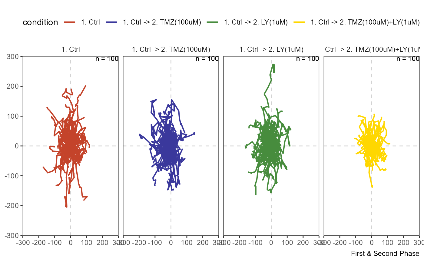
Figure 3.1 Migration plot spanning the whole experiment.
In this example the treatment started at the 18th image which is why the results are best visualized by separating the tracks by phase.
plotAllTracks(object, across = "condition", phase = 1, nrow = 2)

plotAllTracks(object, across = "condition", phase = 2, nrow = 2)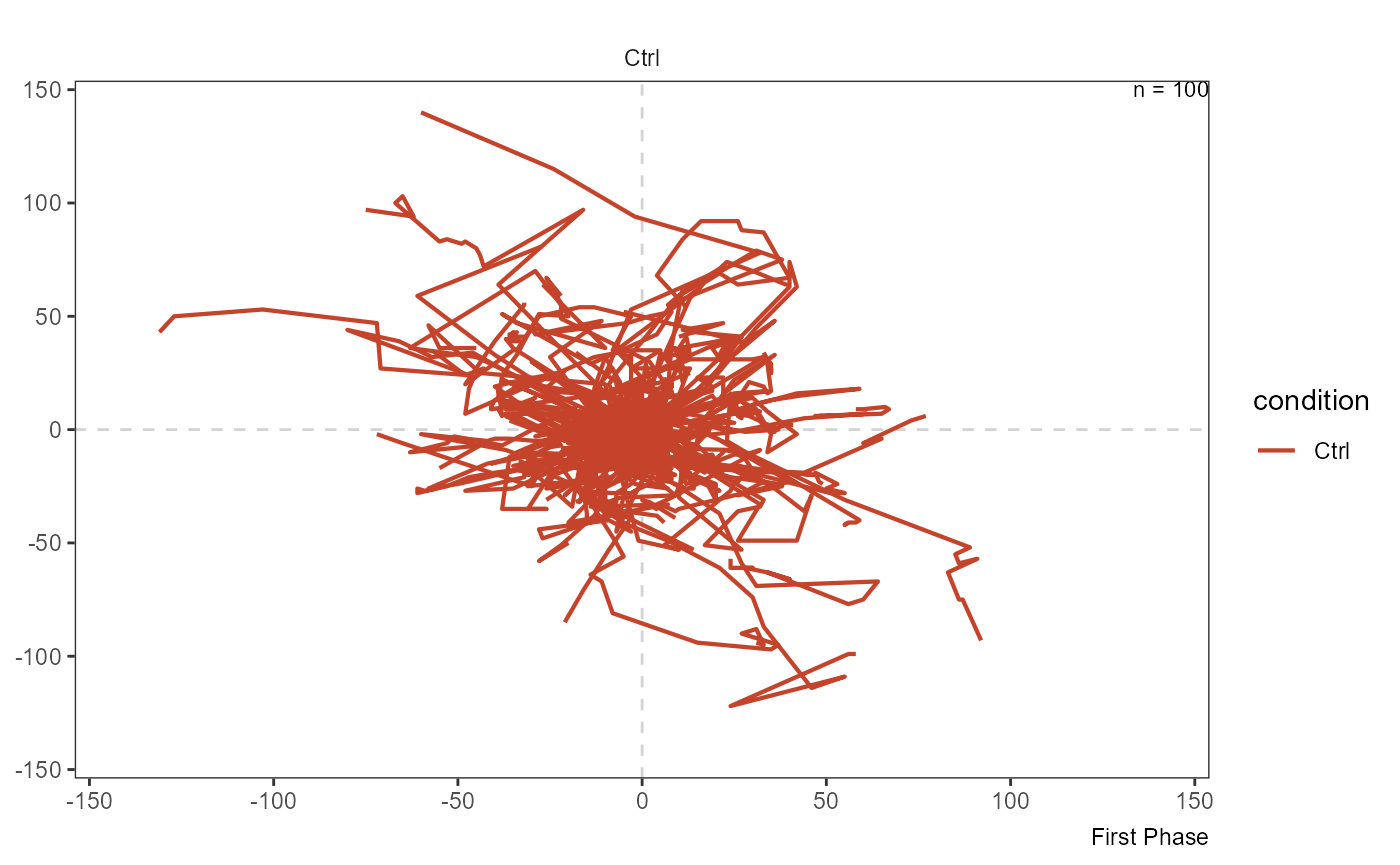
Figure 3.2 Migration plot by phase uncovers the severe effect that the combination of LY34 and TMZ has on cellular migration capacities.
3.2 Single tracks
In case you are interested in the migration path of single cell ids and you have there cell IDs as a character vector you can visualize them via plotSingleTracks().
# e.g. use tidyverse filtering style to filter for cell ids with certain characteristics
max_eff <- getCellIds(object, mgr_eff == max(mgr_eff), phase = 1)

min_eff <- getCellIds(object, mgr_eff == min(mgr_eff), phase = 1)

max_eff
## [1] "CID_15_WI_E9_3_WP_1"
min_eff
## [1] "CID_75_WI_D5_3_WP_1"


plotSingleTracks(object, cell_ids = max_eff, phase = 1)

plotSingleTracks(object, cell_ids = min_eff[1], phase = 1)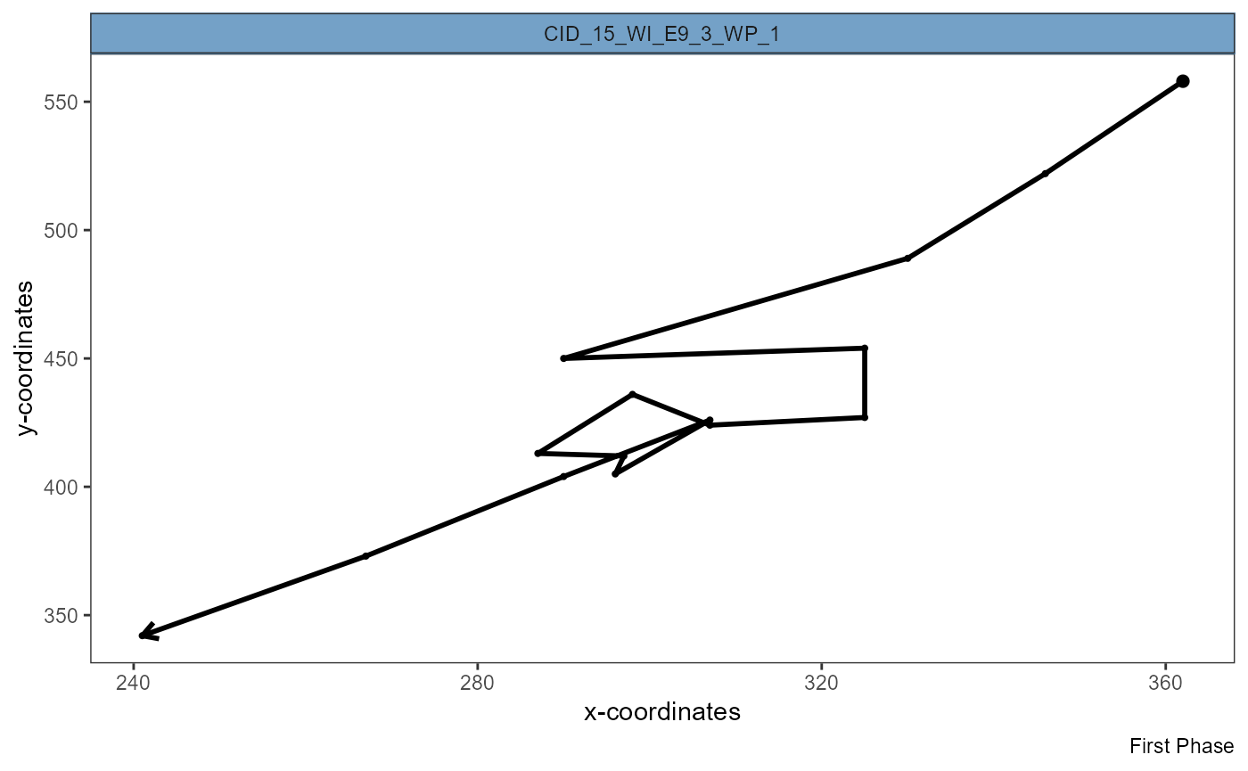
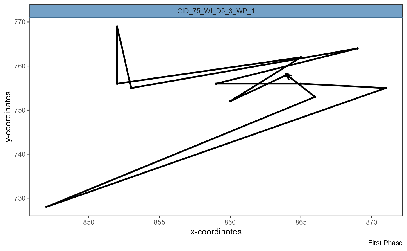
Figure 3.3 Visualization of complete track shows efficient migration (left) and inefficient migration that ended where it started (right).
3.3 Cellular velocity
The speed with which cells move at given points of time is a popular measure in migration analysis. Using lineplots you can visualize the gradual change of speed within groups along a defined time span.
plotTimeLineplot(object,
                 variables = "speed",
                 summarize_with = "mean",
                 across = "condition",
                 display_vline = TRUE,  # highlight treatment start
                 phase = c(1,2)
                 ) +
  legendBottom()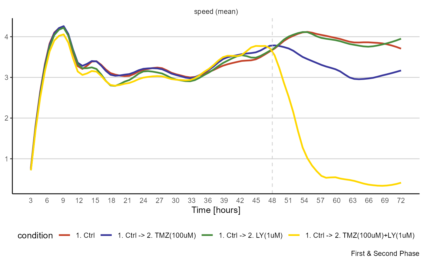
Figure 3.4 Visualization of migrational activity over time.
Using a heatmap preserves more resolution as every row of the heatmap can represent a cell while the lines slope is now represented by the change in color.
plotTimeHeatmap(object,
                variable = "speed",
                across = "condition",
                arrange_rows = FALSE,
                verbose = FALSE, # no progress bar
                phase = c(1,2))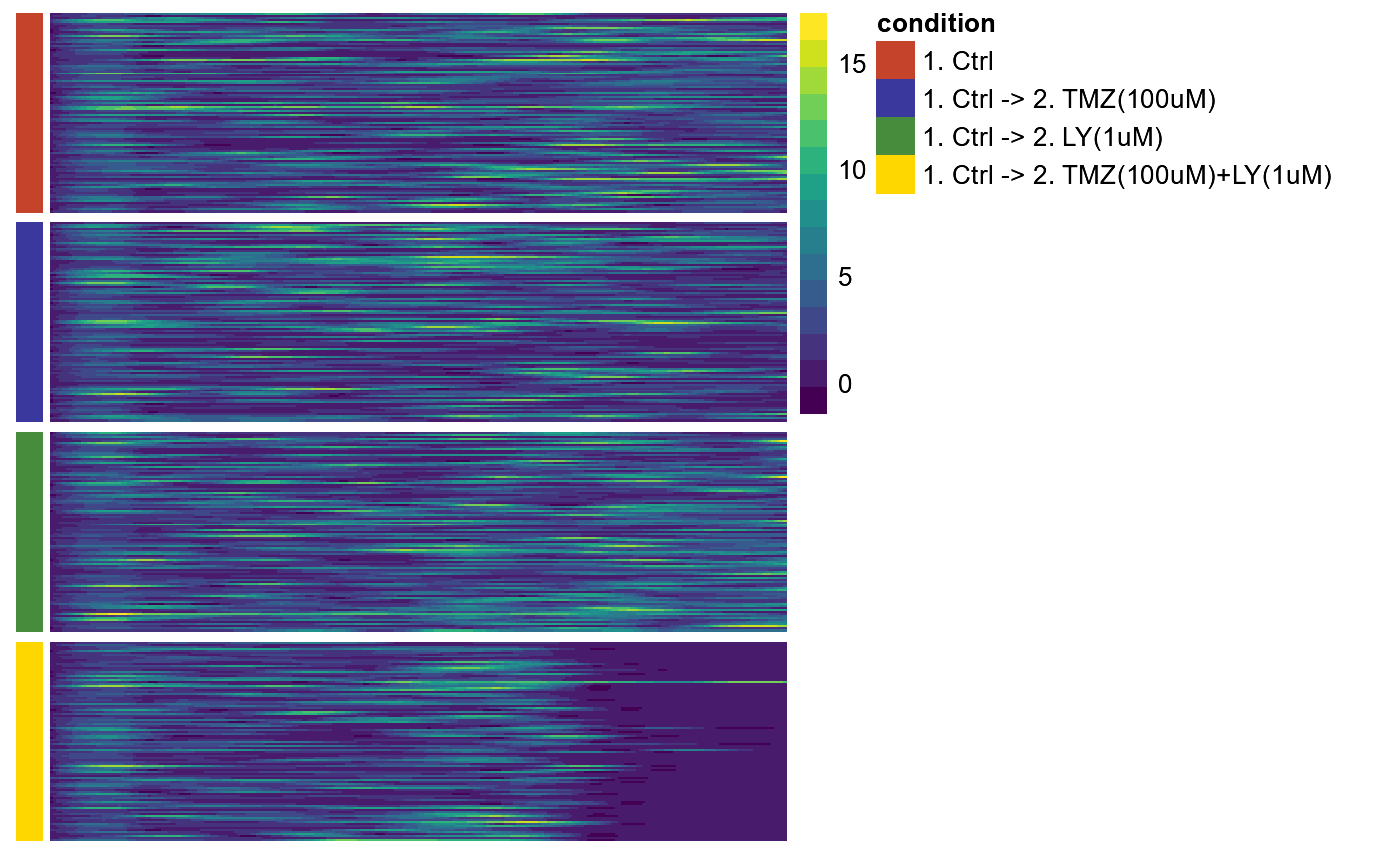
Figure 3.5 Visualization of migrational activity over time in heatmap.